


 Advertising Campaign Budget Tips")
 Tips For Small Business")


Last week we started the new page layout with Bootstrap 3, today we are going to finish it. Today we consider creation of the following elements: sidebar, quotation, main content, ‘our team’ block, footer, twitter feed, site map and social buttons. As usual, we will add them step by step, stylizing our elements.
Sidebar
In the sidebar, in addition to the submenu is also the image with the location of offices.
To display it, we will approach the component “panel”, more exactly – its variation ‘main panel’ (panel-primary) for coloring title. This component contains the header block (panel-heading) and the content block (panel-body). Then we add class img-responsive for the image map, that will decrease the image for small screens (responsiveness).
aside class="col-md-7"
    …
    div class="panel panel-primary"
        div class="panel-heading"Our offices/div
        div class="panel-body"
            img src="images/map.png" class="img-responsive" alt="Our offices"
        /div
    /div
/aside
We already set the color for the background of the panel (panel-bg) in bootstrap’s attributes, and now we point out that ‘primary’ panel will have a gray border of default panel, not blue, as by default:
@panel-primary-border: @panel-inner-border;
Now, in styles of the site we need to change the default settings of panels that can not be changed via variables:
.panel {
  box-shadow: none;
  .panel-heading {
    font: 14px @brand-font;
    text-transform: uppercase;
    padding: 10px;
  }
  .panel-body {
    padding: 10px;
  }
}
Here we have removed the shadow of panels, set custom margins and set own font for the header.
Quotation
We will start the layout of the content by adding the quotation.
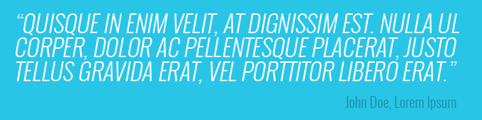
This element of the page is most similar to the Jumbotron component. Add it to the column of content:
section class="col-md-17"
    div class="jumbotron"
        blockquote
            p
                "Quisque in enim velit, at dignissim est. nulla ul corper, dolor ac pellentesque placerat, justo tellus gravida erat, vel porttitor libero erat."
            /p
            smallJohn Doe, Lorem Ipsum/small
        /blockquote
    /div
/section
Via variables of the jumbotron component we define the white color of text and branded blue background:
@jumbotron-bg: @brand-primary;
@jumbotron-color:
And describe our styles:
body {
  …
  .wrapper {
    …
    .jumbotron {
      border-radius: 0;
      padding: 0;
      margin: 0;
      blockquote {
        border-left: none;
        p {
          font: 300 italic 33px @brand-font;
          text-transform: uppercase;
          margin-bottom: 0;
        }
        small {
          text-align: right;
          color:
          font: 300 20px @brand-font;
          :before {
            content: '';
          }
        }
      }
    }
  }
}
Here we remove rounding corners, paddings and decorations of the quotation that are defined in Bootstrap by default. We also add our font styles.
Main content
All necessary styles for text of our content we’ve already added earlier. Therefore, it remains to add only three paragraphs with the text:
pLorem ipsum dolor sit amet.../p
pDonec vel nisl nibh.../p
pDonec vel nisl nibh.../p
The next step is to add two images, that are below the text. This is done using two columns:
div class="row"
  div class="col-md-12"
    img src="images/about-1.png" alt="" class="thumbnail"
  /div
  div class="col-md-12"
    img src="images/about-2.png" alt="" class="thumbnail"
  /div
/div
Class thumbnail transforms images into great looking thumbnails. Thus it does all the work for us for styling images. We only need to set our own margin and border color in the variables for this component:
@thumbnail-padding: 1px;
@thumbnail-border:
‘Our team’ block
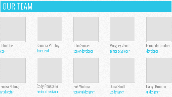
First, we add the header for this section:
h2Our team/h2
with the following styles
body {
  …
  .wrapper {
      …
    h2 {
      background: none repeat scroll 0 0
      color:
      font: 300 30px @brand-font;
      padding: 0 10px;
      text-transform: uppercase;
    }
  }
}
And then add the block with the class team, that consists of two lines containing cards of employees. Each card is a column. Every card has a width equal to four columns of our grid. All cards except the first line have the margin on the left, that is created with col-sm-offset-1 class. Every card consists of image and description:
div class="team"
    div class="row"
        div class="col col-sm-4"
            img src="images/team/Doe.jpg" alt="John Doe" class="thumbnail"
            div class="caption"
                h3John Doe/h3
                pceo/p
            /div
        /div
        div class="col col-sm-4 col-sm-offset-1"
            img src="images/team/Pittsley.jpg" alt="Saundra Pittsley" class="thumbnail"
            div class="caption"
                h3Saundra Pittsley/h3
                pteam leader/p
            /div
        /div
        …
    /div
    div class="row"
        div class="col col-sm-4"
            img src="images/team/Nobriga.jpg" alt="Ericka Nobriga" class="thumbnail"
            div class="caption"
                h3Ericka Nobriga/h3
                part director/p
            /div
        /div
        div class="col col-sm-4 col-sm-offset-1"
            img src="images/team/Rousselle.jpg" alt="Cody Rousselle" class="thumbnail"
            div class="caption"
                h3Cody Rousselle/h3
                psenior ui designer/p
            /div
        /div
        …
    /div
/div
After creating this markup, we define the following styles for these elements:
body {
  …
  .wrapper {
    …
    .team {
      .row {
        margin-top: 20px;
        .col {
          white-space:  nowrap;
          .thumbnail {
              margin-bottom: 5px;
          }
        }
        .col-sm-offset-1 {
          margin-left: 3.7%;
        }
        .caption {
          h3 {
            font: 300 16px @brand-font;
            margin: 0;
          }
          p {
            font: 300 14px @brand-font;
            color: @brand-primary;
            margin: 0;
          }
        }
      }
    }
  }
}
In addition to paddings and fonts, we modified the class col-sm-offset-1. The standard margin was too big, so we changed it to 3.7%.
Footer
Footer consists of four major parts: the Twitter feed, site map, social links and logo with copyright text.

First, we create a container for the footer with these blocks:
footer
  div class="container"
    div class="row"
      div class="col-md-8 col-xs-12 twitter"/div
      div class="col-md-4 col-xs-12 sitemap"/div
      div class="clearfix visible-sm visible-xs"/div
      div class="col-md-6 col-xs-12 social"/div
      div class="col-md-6 col-xs-12 footer-logo"/div
    /div
  /div
/footer
then we customize it:
footer {
  background:
  color:
  font-size: 11px;
  overflow: hidden;
  .container {
    height: 110px;
    padding: 10px 0;
  }
}
Tag footer defines a gray area across the width of the screen, and internal container displays another area that is centered on the large screens and sets the height and margin of the footer. To align blocks within the footer, we use columns.
Twitter feed
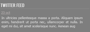
The markup of the twitter feed is the following:
div class="col-md-8 col-xs-12 twitter"
  h3Twitter feed/h3
  time datetime="2015-03-03"a href="#"03 mar/a/time
  pIn ultricies pellentesque massa a porta. Aliquam ipsum enim, hendrerit ut porta nec, ullamcorper et nulla. In eget mi dui, sit amet scelerisque nunc. Aenean aug/p
/div
Now we define styles for this section:
body {
  …
  footer {
    …
    .container {
      …
      h3 {
        border-bottom: 1px solid
        color:
        font-size: 14px;
        line-height: 21px;
        font-family: @brand-font;
        margin: 0 0 10px;
        text-transform: uppercase;
      }
      p {
        margin: 5px 0;
      }
      .twitter {
        p {
          padding-right: 15px;
        }
        time a {
          color:
          text-decoration: underline;
        }
      }
    }
  }
}
For all titles of footer we specify fonts and margins, and underline the bottom frame. For paragraphs we set paddings. For the link that displays the date, we set the color and underlining.
Sitemap
Site map consists of two equal columns with links:
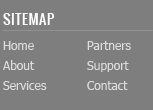
div class="col-md-4 col-xs-12 sitemap"
    h3Sitemap/h3
    div class="row"
        div class="col-md-12"
            a href="/home/"Home/a
            a href="/about/"About/a
            a href="/services/"Services/a
        /div
        div class="col-md-12"
            a href="/partners/"Partners/a
            a href="/customers/"Support/a
            a href="/contact/"Contact/a
        /div
    /div
/div
We apply a color, font and margin for the links:
body {
  …
  footer {
    …
    .container  {
      …
      a {
        color:
      }
      .sitemap a {
        display: block;
        font-size: 12px;
        margin-bottom: 5px;
      }
    }
  }
}
Social buttons

We put a set of links (buttons) in the block with the social class:
div class="col-md-4 col-xs-12 social"
  h3Social networks/h3
  a href="http://twitter.com/" class="social-icon twitter"/a
  a href="http://facebook.com/" class="social-icon facebook"/a
  a href="http://plus.google.com/" class="social-icon google-plus"/a
  a href="http://vimeo.com/" class="social-icon-small vimeo"/a
  a href="http://youtube.com/" class="social-icon-small youtube"/a
  a href="http://flickr.com/" class="social-icon-small flickr"/a
  a href="http://instagram.com/" class="social-icon-small instagram"/a
  a href="/rss/" class="social-icon-small rss"/a
/div
And Styling the footer with links:
body {
  …
  footer {
    …
    .container {
      …
      .social {
        .social-icon {
          width: 30px;
          height: 30px;
          background: url(../images/social.png) no-repeat;
          display: inline-block;
          margin-right: 10px;
        }
        .social-icon-small  {
          width: 16px;
          height: 16px;
          background: url(../images/social-small.png) no-repeat;
          display: inline-block;
          margin: 5px 6px 0 0;
        }
        .twitter { background-position: 0 0; }
        .facebook { background-position: -30px 0; }
        .google-plus { background-position: -60px 0; }
        .vimeo { background-position: 0 0; }
        .youtube { background-position: -16px 0; }
        .flickr { background-position: -32px 0; }
        .instagram { background-position: -48px 0; }
        .rss { background-position: -64px 0; }
      }
    }
  }
}
Here we used the technique of sprites – when one image file is used for different images. All links are divided into large icons (.social-icon) and small (.social-icon-small). We set our sprite image to these classes as inline block with with fixed sizes and the same background. And then with CSS we shifted the background so that each link will display the corresponding image.
Copyright
Block with copyright and logo – it is a picture with link and a paragraph with text under it.
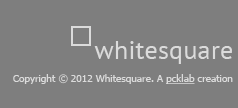
div class="col-md-8 col-xs-12 footer-logo"
  a href="/"img src="images/footer-logo.png" alt="Whitesquare logo"/a
  pCopyright © 2015 Whitesquare./p
/div
Styles are similar to the previous blocks with the only difference that the block is aligned to the right side and alignment within it as well on the right:
body {
  …
  .footer {
    …
    .container {
      …
      .footer-logo {
        float: right;
        margin-top: 20px;
        font-size: 10px;
        text-align: right;
        a {
          text-decoration: underline;
        }
      }
    }
  }
}
Live Demo
[sociallocker]
download in package
[/sociallocker]


