I am pretty sure that you understand the importance of website navigation menu and it’s correlation with on site engagement. Here are ten UX tips to make it more usable.
Navigation is an important part for any website of any scale or any business. Because navigation is the only way your visitors will get to know about your products/services.
Stuffing your navigation with the all the pages links would not work any longer. You need to be careful how your navigation will look and what you will include in your navigation.
If you are confused or looking for some suggestions on what to consider while designing a navigation menu, here are eight points to help you out!
1. Fixed navigation:
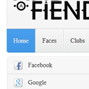
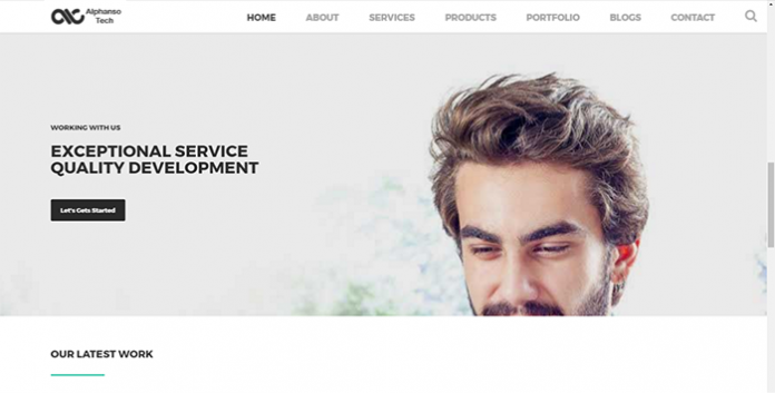
Having a fixed navigation bar on top is really handy for your visitors. It gives them a real ease navigating your website.
Consider a case where you have a horizontal navigation bar on your website. A visitor has scroll down the page to the bottom. And now he wants to have a look at your about page!
He might need to scroll all the way up to find the about page link to visit the page. Fixed menu on top help you fix this problem.
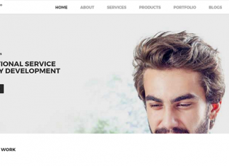
Please make sure that your horizontal top navigation menu items looks and orient the same on different screen sizes. I am talking about various desktop and laptop screen sizes. A uniformity in the navigation help you deliver the consistent experience on all the devices.
2. Focus on mobile version of navigation:
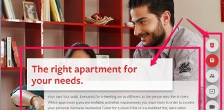
You can’t really ignore the mobile visitors of your website. And in the era of mobile first websites were responsive frameworks like bootstrap are trending you need to pay a proper attention to mobile navigation of your website.
The only downsides of mobile navigations are they don’t really have hover support. So if you have written the media query based navigation with hover based effects that may look uniform on mobile devices but they wouldn’t perform the same.
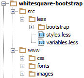
While the framework like bootstrap has good support for both the mobile and desktop view of navigation out of the box. However it has an office-like styles.
Make sure while you create navigation for your website you don’t overuse the JavaScript code that may give cool visual effect to users but make it tough job for crawlers like Googlebot to crawl and understand your navigation structure.
Making your navigation impossible to crawl is the worst thing you can ever do with your navigation. While user experience is our top priority but we certainly can’t ignore the search engine crawlers.
3. Place search bar:
As far as the user experience is concerned making your site searchable is the best thing you can ever do with your site. If your website has plenty of pages, making it searchable should be your first priority.
There has always been confusion that where should I put the search bar? How do I make my search box noticed without distracting the user or affecting the user experience?
I have read couple of articles suggesting keeping the search box hidden behind the magnify icon. Hitting the icon bring you the search box. Entering the search query and hitting enter will get the job done.
I read some case studies where making the search box hidden behind the magnify icon creates confusion to users on how to search website and what this icon will do! Additionally, for some websites it contributed lesser number of searches.
So, I would suggest that you do have a search box visible on your navigation. Don’t hide it anywhere to save few pixel space. And if you want to make your search box noticed, you may consider placing it on the left side of your navigation, just like the Facebook and YouTube!
4. Better organized menu:
You may have plenty of product or services to be included into your website navigation. It would be great if you can organize them in some order.
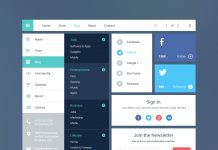
If you have large number of navigation items going in your website, you can think of having a mega menu.
Group the menu items by their origin parent category. Like if you are a creating agency offering various designing services from graphic, web, mobile app and many others then you may consider graphic design as your parent category for brochure design, flyer design, logo design like services.
Grouping things makes it easy to skimming through your navigation to your visitors. Additionally it helps them locate their desired items just by looking at the group category. This makes skimming and searching bit easy.
I would suggest you to ignore very large number of sub-menu items. Having up to seven sub menu items makes it easy for your visitors to understand and find desired item(s) easy.
Keep one rule in mind, your visitors will have the first menu item and last menu item in mind. Make sure you put the links on both the location. Having Contact or Inquiry button/link that differentiates itself with other navigation items will increase the chance of getting clicked.
5. Vertical menu:
Well, I know vertical menu is the old school way of organizing navigational links. Hold on I’m not talking about replacing your awesome horizontal menu with vertical menu.
I am rather suggesting you to have a vertical menu for your inner pages where you need to show some nested options. There are some cases where you need to show an additional menu for a page. Having another horizontal menu will definitely disturb your user experience.
Are you familiar with the eCommerce website designs? Have seen the page design when you hit the computer accessory? I am talking about the very same vertical menu for inner pages where you can display additional options, links, information, and filter parameters.
It helps you make your website’s navigation clean. Visitors will only see the vertical menu when they visit the inner pages.
6. Evaluate menu items:
It’s a misconception that all the visitors come to your website through your home page. Check your analytics, you have multiple entry point to your website.
Meaning navigation items are not the place from where your visitors will land into your deeper product or services pages. An organic search result brings them to those pages.
So, you don’t always have to include every link/page into your navigation. Only keep the items that are really important to your business. And the items that are getting clicks from the navigation.
Google analytics might be your best buddy to find out which navigation links are getting clicked. Goto Behaviour Flow and filter the result starting by / or home page.
It helps you understand which are the menu items that your visitors care most about. Apply the same for the pages that drives traffic to your website to have better idea on what to keep and what to skip.
Once the research done, modify your navigation panel. The new navigation will have much less items, less clutter, and better organized navigation menu.
7. Avoid too much nesting:
As said in the above point, keep only important links based on your visitors behavior. It helps you make the things clear.
Additionally, avoid having too much nesting of categories, subcategories and items. Having one level of nesting like Parent Category – items will serve the purpose very well.
8. Little miscellaneous things:
There are some miscellaneous things you can consider while designing the navigation menu. Here are they:
• Avoid wired designs:
Avoid wired design for navigation menu just for the sake of being different. Being creating and designing minimalistic navigation is way different than creating weird looking navigation to earn the different badge. Don’t do it. You may understand and love it, but your visitors wouldn’t.
• Be consistent:
Consistency gives uniformity. Use the same navigation menu across all the pages of your website. It will make your visitor more familiar with your website. They may find it easy to locate the desired items.
• Make it clear and descriptive:
Be clear with the navigation item name. It should open the same page what you written on the navigation item text. If possible avoid using the generic names like products and services. Instead apply the point 06 evaluate menu items. Have the descriptive item name like logo design, mobile screen repair, ERP solutions, Payment gateway integration like descriptive names.
• Test it:
I know you are using some reliable front end framework like bootstrap to design website and navigation menu. But spare some time and test your navigation menu on all major web browsers. Check for functionality on both the desktop version of browser as well as mobile versions.
Conclusion:
It only takes website usage data, creative thoughts, and some common concerns to create a highly usable and well experiencing navigation menu. The eight points discussed here would help you decide what to do next with your navigation menu.


