At the same time Google released their Lollipop version of the Android OS, they also introduced a new visual design language known simply as Material Design. The goal? To create a cohesive design standard that could work across all of Google’s various products. It has a set of principles and styles, along with plenty of rules to define the exact layout.
Today we’re going to look at Material Design and what it seeks to achieve. After an overview of the language, we’ll then look at five excellent examples of Material Design in action so you can decide if it’s right for your website.
What is Material Design? An Overview
The primary goal of Material Design is to create experiences that are accessible, practical, and usable. Google has an ongoing and constantly-updated document that helps designers familiarize themselves with the practice.
Looking at the document, these are the primary goals of Material Design:
- Establish a visual language that is informed by the practices of good design and incorporates the innovation brought about by technology and science.
- Develop a single system that creates a unified experience across multiple devices, platforms, and screen sizes. Mobile is key, but this also extends to touch, voice, mouse, keyboard, and other input methods.
Starting with these goals in mind, the next step is to look at the principles that Material Design champions:
- Material itself is a metaphor for the design elements. Visual cues and aspects of the design should be grounded in reality.
- Employ all major tenets of modern web design including use of typography, space, colors, images, and so on.
- Motion = meaning, which means that objects with movement or animation should never disrupt or take away from the primary user experience. Instead, they should complement it.
Overall, the principles of Material Design are informed by materials as they exist in the real world. Objects within your design should exist in a theoretical 3D space of sorts.
Next, we’ll take a look at a few of the major categories of Material Design:
Color Choices and Typography Practices
In terms of color and text, Material Design takes much of the best practices from standard flat design. In this sense, the color choices are typically bold and stand out from standard color choices. Simple, but equally bold typography is also recommended.
Here’s an excerpt from Google’s document on the subject: “Color is inspired by bold color statements juxtaposed with muted environments, taking cues from contemporary architecture, road signs, pavement marking tape, and sports courts,” according to material design documentation. “Emphasize bold shadows and highlights. Introduce unexpected and vibrant colors.”
In essence, everything we know and love about color theory is intact here, but it’s important to revisit the basics before learning something new.
Layout and Design Choices
The layout and design choices for Material Design tend to mimic those from print. Grids and structured layouts are encouraged and recommended. Google provides guidelines for where to place specific elements and how large they should be for maximum effectiveness.
The biggest risk here is following the guidelines too closely and coming across as generic or too similar to other uses of the design. There should be some variety in this regard while still staying within the general boundaries of Material Design.
Overall Usability
The ultimate goal of Material Design is to point out and utilize patterns that allow for maximum usability and accessibility. At a quick glance, many of the provided elements will come across as too basic to veteran designers.
Even so, the principles that guide the user experience are worth looking at, regardless of your skill level. This thought process also calls to mind very real issues with accessibility. How do we design for users who cannot hear or see specific colors?
Options like high contrast, magnified screens, or even voice control can all contribute to a more universal design. In the end, Google’s approach is a little heavy-handed for designers who have experience, but whether it’s for a refresh, or to aid a beginner, there are some good ideas here.
Now, let’s take a look at some examples of websites that are adhering to Material Design principles, and how that affects the user experience.
5 Examples of Material Design in Action
These examples take the three-dimensional and simplified approach that Material Design champions. This is a popular option for startup companies as it offers a fresh and clean layout for their website.
Let’s take a look:
1. Wohn Beratung Wien
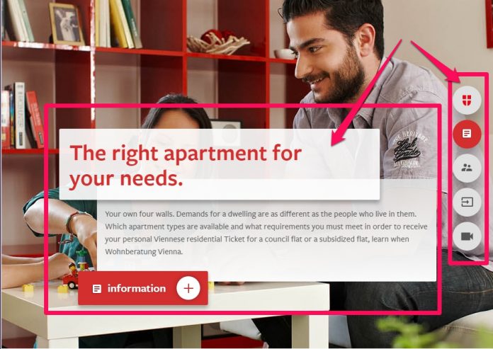
Our first example of Material Deisgn is a slice from the Wohn Beratung Wien homepage. The website itself is laid out with modular elements and simple typography. Where we see the material design truly shine is the use of the floating elements in the center of the screen.
As you can see, there’s a defined sense of 3D space and the overlapping design provides a nice focal point for the eyes. Furthermore, the CTA button benefits from bold colors and conrast, in addition to seemingly floating above the other boxes.
The navigation bar floats on the right side of the screen with simple icons to take users to other pages. As you scroll down the website, you find these self-contained modules that each offer their own information and CTA.
2. Jetradar
Next up, we have the mobile version of the Jetradar website, which is a search engine for flights. Material Design is employed here in two ways: vibrant color, and extreme usability. At the top, we can place our origin and destination and beneath that are the dates.
Very simple and clean, with good contrast between the white background and the gray text. The floating button in the bottom corner utilizes a bright color and a floating style that helps it stand out as the clear path forward.
3. Stamplay
Here we have a site that is both simple and mobile-friendly. Notice the verticality of the design. Everything flows together in a column shape that keeps the reader descending through the page. There are two CTAs in total: one in the screenshot above, and another at the bottom of the page.
These buttons have a very subtle floating animation when you mouse over them. It provides the sense of movement that imparts meaning and reinforces the function of the button as something interactive.
As we scroll down through the page, there are simple and colorful icons used, along with dark text on a white background to ultimately create a seamless flow of information. Finally, the bottom of the page there’s a final layout of features, reinforced by simple icons and a second CTA.
4. Android
Sometimes the best place to go is straight to the source. In a world where Apple’s simplistic approach encourages a strong user experience, Material Design seeks to meet similar needs through an equal level of simplicity.
Here we can see a slide from the Android homepage. The graphic of the phone casts a shadow and provides depth to the image without actually being three-dimensional. The typography is classic dark text on a light background, and the CTA button stands out with a vibrant and violet color choice.
5. I/O 2015
Here we have another example straight from the source. This is a screenshot from the Google I/O 2015 page that employs Material Design to the fullest. The images in the background as used to create a visually enticing experience, while the floating boxes help the text integrate into the overall design.
Final Thoughts
Material Design is Google’s answer to the long-standing crown that Apple has held in regards to a universally accessible user experience. While this style began on Android apps, it has since made its way into the field of web design.
These tips and examples will give you the understanding you need to take these concepts and make them your own. How do you incorporate Material Design into your web design? Let us know in the comments!
