


 Advertising Campaign Budget Tips")
 Tips For Small Business")


Our sixth jQuery Mobile tutorial – final article in this series. Today we discuss how to create ul-li lists, how to theme the lists, numbered lists. Also we explain how to use thumbnails and icons in the lists, how to make search and login forms using different form elements. All examples are supported with code snippets.
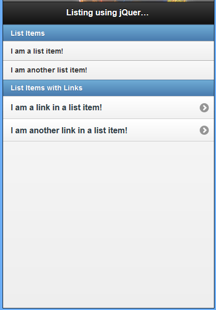
CREATING A STANDARD LIST
Using HTML, you can make a standard list by creating a ul element and placing li elements inside it. To make a standard list in jQuery Mobile you follow the same setup only you need to add an attribute of data-role="listview" to the ul element.
Example 51: Listing using jQuery mobile
 !DOCTYPE html
html
head
  titleScript-Tutorials: Listing with jQuery Mobile/title
  meta name="viewport" content="width=device-width, initial-scale=1"
  link rel="stylesheet" href="http://code.jquery.com/mobile/1.1.0/jquery.mobile-1.1.0.min.css" /
  script src="http://code.jquery.com/jquery-1.7.1.min.js"/script
  script src="http://code.jquery.com/mobile/1.1.0/jquery.mobile-1.1.0.min.js"/script
/head
body
  div data-role="page"
    div data-role="header"
      h1Listing using jQuery Mobile/h1
    /div
    div data-role="content"
      ul data-role="listview"
        li data-role="list-divider"List Items/li
        liI am a list item!/li
        liI am another list item!/li
        li data-role="list-divider"List Items with Links/li
        lia href="#"I am a link in a list item!/a
        /li
        lia href="#"I am another link in a list item!/a
        /li
      /ul
    /div
  /div
/body
/html
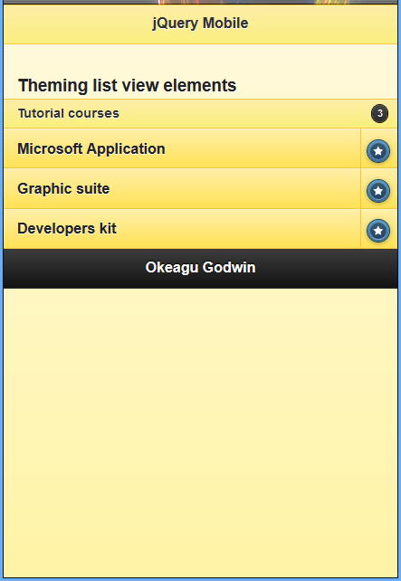
THEMING LIST VIEW ELEMENTS
For added flexibility in list views, jQuery Mobile has implemented some specific dataattributes for theming dividers, count bubbles, and split buttons.
To theme a list divider, you can either apply a data-theme attribute to it directly, or you can use data-divider-theme attribute, which you can apply to the parent ul tag.
For count bubbles, use the data-count-theme attribute. You can apply it to the containing ul tag to theme all count bubbles in the list, or to individual list items to specify different count bubble themes within a given list.
Use the data-split-theme and data-split-icon attributes to theme split buttons. The data-split-theme attribute allows you to specify the theme of the right button in split buttons, and can be applied to either the containing ul or to individual list items.
Example 52: Using jQuery theme in listing components
!DOCTYPE html
html
head
  titleScript-Tutorials: Cutomized icons in jQuery Mobile/title
  meta name="viewport" content="width=device-width, initial-scale=1"
  link rel="stylesheet" href="http://code.jquery.com/mobile/1.1.0/jquery.mobile-1.1.0.min.css" /
  script src="http://code.jquery.com/jquery-1.7.1.min.js"/script
  script src="http://code.jquery.com/mobile/1.1.0/jquery.mobile-1.1.0.min.js"/script
/head
body
  section id="swatch-e" data-role="page" data-theme="e"
    header data-role="header" data-theme="e"
      h1jQuery Mobile/h1
    /header
    div class="content" data-role="content"
      h3Theming list view elements/h3
      ul data-role="listview" data-split-icon="star" data-divider-theme="e" data-count-theme="a"
        li data-role="list-divider"Tutorial coursesspan class="ui-li-count"3/span
        /li
        lia href="application.php"Microsoft Application/aa href="order.php"Make order/a
        /li
        lia href="suite.php"Graphic suite/aa href="apply.php"Apply now/a
        /li
        lia href="dkit.php"Developers kit/aa href="request.php"Request now/a
        /li
      /ul
    /div
    footer data-role="footer"
      h1footer/h1
    /footer
  /section
/body
/html
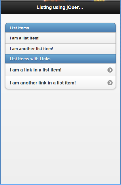
CREATING AN INSET LIST
To create an inset list, you start by creating a standard list and then add an attribute of data-inset="true" to the ul element. We change the first line to make our list inset: ul data-role="listview" data-inset="true"
Example 53: Creating an inset list
!DOCTYPE html
html
head
  titleScript-Tutorials: Listing with jQuery Mobile/title
  meta name="viewport" content="width=device-width, initial-scale=1"
  link rel="stylesheet" href="http://code.jquery.com/mobile/1.1.0/jquery.mobile-1.1.0.min.css" /
  script src="http://code.jquery.com/jquery-1.7.1.min.js"/script
  script src="http://code.jquery.com/mobile/1.1.0/jquery.mobile-1.1.0.min.js"/script
/head
body
  div data-role="page"
    div data-role="header"
      h1Listing using jQuery Mobile/h1
    /div
    div data-role="content"
      ul data-role="listview" data-inset="true"
        li data-role="list-divider"List Items/li
        liI am a list item!/li
        liI am another list item!/li
        li data-role="list-divider"List Items with Links/li
        lia href="#"I am a link in a list item!/a
        /li
        lia href="#"I am another link in a list item!/a
        /li
      /ul
    /div
  /div
/body
/html
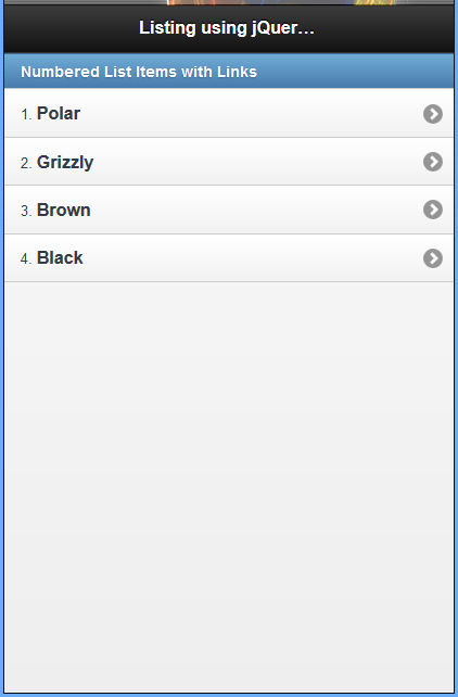
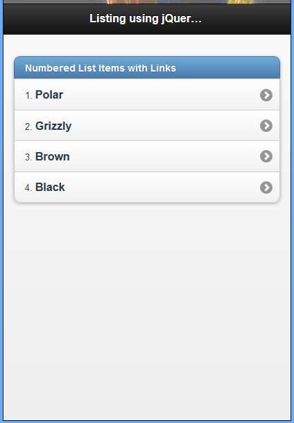
USING NUMBERED LISTS
To create a numbered list you need to start with an ol lement and include li elements inside it. Each li element is automatically numbered based on the position it is placed in the ol element.
Example 54: Using jQuery mobile to create numbered list
!DOCTYPE html
html
head
  titleScript-Tutorials: Listing with jQuery Mobile/title
  meta name="viewport" content="width=device-width, initial-scale=1"
  link rel="stylesheet" href="http://code.jquery.com/mobile/1.1.0/jquery.mobile-1.1.0.min.css" /
  script src="http://code.jquery.com/jquery-1.7.1.min.js"/script
  script src="http://code.jquery.com/mobile/1.1.0/jquery.mobile-1.1.0.min.js"/script
/head
body
  div data-role="page"
    div data-role="header"
      h1Listing using jQuery Mobile/h1
    /div
    div data-role="content"
      ol data-role="listview"
        li data-role="list-divider"Numbered List Items with Links/li
        lia href="#"Polar/a
        /li
        lia href="#"Grizzly/a
        /li
        lia href="#"Brown/a
        /li
        lia href="#"Black/a
        /li
      /ol
    /div
  /div
/body
/html
Example 55: Using jQuery mobile to create an inset numbered list
While this numbered list was not set up as an inset numbered list, it can be created as one by using the data-inset="true" attribute on the ol element.
!DOCTYPE html
html
head
  titleScript-Tutorials: Listing with jQuery Mobile/title
  meta name="viewport" content="width=device-width, initial-scale=1"
  link rel="stylesheet" href="http://code.jquery.com/mobile/1.1.0/jquery.mobile-1.1.0.min.css" /
  script src="http://code.jquery.com/jquery-1.7.1.min.js"/script
  script src="http://code.jquery.com/mobile/1.1.0/jquery.mobile-1.1.0.min.js"/script
/head
body
  div data-role="page"
    div data-role="header"
      h1Listing using jQuery Mobile/h1
    /div
    div data-role="content"
      ol data-role="listview" data-inset="true"
        li data-role="list-divider"Numbered List Items with Links/li
        lia href="#"Polar/a
        /li
        lia href="#"Grizzly/a
        /li
        lia href="#"Brown/a
        /li
        lia href="#"Black/a
        /li
      /ol
    /div
  /div
/body
/html
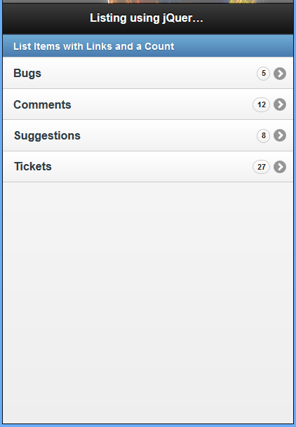
ADDING A COUNT TO LIST IN JQUERY MOBILE
A style that is popular with some messaging or email apps is to display the number of items, or count of items, contained within a subsection or link. You can replicate this style using an element with class="ui-li-count" inside your li elements.
Example 56: Using jQuery mobile to Implement a Count in a Standard List
!DOCTYPE html
html
head
  titleScript-Tutorials: Listing with jQuery Mobile/title
  meta name="viewport" content="width=device-width, initial-scale=1"
  link rel="stylesheet" href="http://code.jquery.com/mobile/1.1.0/jquery.mobile-1.1.0.min.css" /
  script src="http://code.jquery.com/jquery-1.7.1.min.js"/script
  script src="http://code.jquery.com/mobile/1.1.0/jquery.mobile-1.1.0.min.js"/script
/head
body
  div data-role="page"
    div data-role="header"
      h1Listing using jQuery Mobile/h1
    /div
    div data-role="content"
      ul data-role="listview"
        li data-role="list-divider"List Items with Links and a Count/li
        lia href="#"Bugsspan class="ui-li-count"5/span/a
        /li
        lia href="#"Commentsspan class="ui-li-count"12/span/a
        /li
        lia href="#"Suggestionsspan class="ui-li-count"8/span/a
        /li
        lia href="#"Ticketsspan class="ui-li-count"27/span/a
        /li
      /ul
    /div
  /div
/body
/html
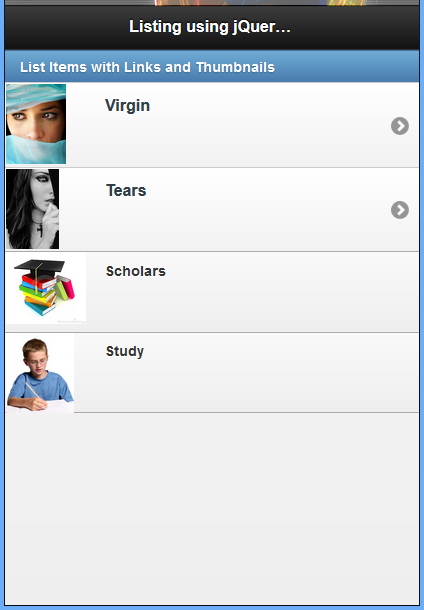
ADDING ICONS AND THUMBNAILS IN LISTING USING JQUERY
When you are styling a list you may want to include an icon or thumbnail image with each item in the list. This is not only possible but is easy to do.
ADDING A THUMBNAIL
A thumbnail image is a preview or smaller version of a full-sized image. Thumbnail images can be added to list items by including them inside an a element in your li element.
Example 57: Using jQuery mobile to add thumbnails in List
!DOCTYPE html
html
head
  titleScript-Tutorials: Listing with jQuery Mobile/title
  meta name="viewport" content="width=device-width, initial-scale=1"
  link rel="stylesheet" href="http://code.jquery.com/mobile/1.1.0/jquery.mobile-1.1.0.min.css" /
  script src="http://code.jquery.com/jquery-1.7.1.min.js"/script
  script src="http://code.jquery.com/mobile/1.1.0/jquery.mobile-1.1.0.min.js"/script
/head
body
  div data-role="page"
    div data-role="header"
      h1Listing using jQuery Mobile/h1
    /div
    div data-role="content"
      ul data-role="listview"
        li data-role="list-divider"List Items with Links and Thumbnails/li
        li
          a href="#"img src="images/virgin.jpg" alt="A Virgin" /Virgin/a
        /li
        li
          a href="#"img src="images/tear.jpg" alt="Tears" /Tears/a
        /li
        liimg src="images/scholar.jpg" alt="Scholars" /Scholars/li
        liimg src="images/studying.jpg" alt="Study" /Study/li
      /ul
    /div
  /div
/body
/html
ADDING ICONS TO LIST ITEMS
Example 58: Using jQuery mobile to add icons to List items
!DOCTYPE html
html
head
  titleScript-Tutorials: Listing with jQuery Mobile/title
  meta name="viewport" content="width=device-width, initial-scale=1"
  link rel="stylesheet" href="http://code.jquery.com/mobile/1.1.0/jquery.mobile-1.1.0.min.css" /
  script src="http://code.jquery.com/jquery-1.7.1.min.js"/script
  script src="http://code.jquery.com/mobile/1.1.0/jquery.mobile-1.1.0.min.js"/script
/head
body
  div data-role="page"
    div data-role="header"
      h1Listing using jQuery Mobile/h1
    /div
    div data-role="content"
      ul data-role="listview"
        li data-role="list-divider"List Items with Links and Thumbnails/li
        li
          a href="#"img class="ui-li-icon" src="images/virgin.jpg" alt="A Virgin" /Virgin/a
        /li
        li
          a href="#"img class="ui-li-icon" src="images/tear.jpg" alt="Tears" /Tears/a
        /li
        liimg class="ui-li-icon" src="images/scholar.jpg" alt="Scholars" /Scholars/li
        liimg class="ui-li-icon" src="images/studying.jpg" alt="Study" /Study/li
      /ul
    /div
  /div
/body
/html
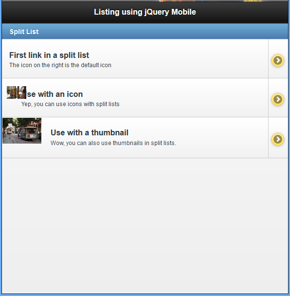
CREATING A SPLIT LIST
A split list is a list that contains list items that have more than one link in them. When you place two a elements inside an li element, jQuery Mobile automatically creates a split list.
The first a element takes the majority of space of the list item leaving the second a element a small section with space for an icon on the right side of the list item. Because split lists are automatically created by adding a second link, you can mix other list extras together.
Example 59: Using jQuery mobile to create a split List
!DOCTYPE html
html
head
  titleScript-Tutorials: Listing with jQuery Mobile/title
  meta name="viewport" content="width=device-width, initial-scale=1"
  link rel="stylesheet" href="http://code.jquery.com/mobile/1.1.0/jquery.mobile-1.1.0.min.css" /
  script src="http://code.jquery.com/jquery-1.7.1.min.js"/script
  script src="http://code.jquery.com/mobile/1.1.0/jquery.mobile-1.1.0.min.js"/script
/head
body
  div data-role="page"
    div data-role="header"
      h1Listing using jQuery Mobile/h1
    /div
    div data-role="content"
      ul data-role="listview" data-split-theme="e"
        li data-role="list-divider"Split List/li
        li
          a href="#"
            h3First link in a split list/h3
            pThe icon on the right is the default icon/p
          /a
          a href="#" title="Second Link"Second link in a split list/a
        /li
        li
          a href="#"
            img class="ui-li-icon" src="images/cable_car2.jpg" alt="Cars on route" /
            h3Use with an icon/h3
            pYep, you can use icons with split lists/p
          /a
          a href="#" title="Another link"Another split list link/a
        /li
        li
          a href="#"
            img src="images/cable_car1.jpg" alt="Cars on wires" /
            h3Use with a thumbnail/h3
            pWow, you can also use thumbnails in split lists./p
          /a
          a href="#" title="Titles are accessible"Another split list link/a
        /li
      /ul
    /div
  /div
/body
/html
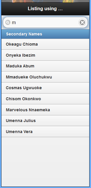
SEARCHING LIST CONTENT
If you are using a list to display a large number of items you may want to include a search filter to help users navigate through your selection to find what they need.
Creating a search filter is easier than you might think. All you need to do is add an attribute of data-filter="true" to the ul element of your list.
Example 60: Using jQuery mobile to create searching list content
!DOCTYPE html
html
head
  titleScript-Tutorials: Listing with jQuery Mobile/title
  meta name="viewport" content="width=device-width, initial-scale=1"
  link rel="stylesheet" href="http://code.jquery.com/mobile/1.1.0/jquery.mobile-1.1.0.min.css" /
  script src="http://code.jquery.com/jquery-1.7.1.min.js"/script
  script src="http://code.jquery.com/mobile/1.1.0/jquery.mobile-1.1.0.min.js"/script
/head
body
  div data-role="page"
    div data-role="header"
      h1Listing using jQuery Mobile/h1
    /div
    div data-role="content"
      ul data-role="listview" data-filter="true"
        li data-role="list-divider"Secondary Names/li
        liOkeagu Chioma/li
        liNonso Diobi(S.P)/li
        liIkenna Okoye/li
        liAgu Chidera/li
        liOnyeka Ibezim/li
        liMaduka Abum/li
        liFelix Onah/li
        liMmadueke Oluchukwu/li
        liNneka Ebeonadi/li
        liCosmas Ugwuoke/li
        liChisom Okonkwo/li
        liMarvelous Nnaemeka/li
        liUmenna Julius/li
        liLeonard Onah/li
        liFerdinand Okoro/li
        liShedrack Onah/li
        liUmenna Vera/li
      /ul
    /div
  /div
/body
/html
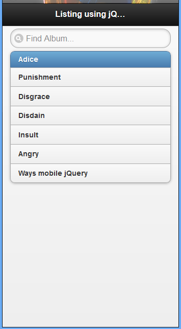
CUSTOMIZING THE SEARCH FILTER TEXT ON AN INSET LIST
Example 61: Using jQuery mobile to create a search filter text on an inset list
!DOCTYPE html
html
head
  titleScript-Tutorials: Listing with jQuery Mobile/title
  meta name="viewport" content="width=device-width, initial-scale=1"
  link rel="stylesheet" href="http://code.jquery.com/mobile/1.1.0/jquery.mobile-1.1.0.min.css" /
  script src="http://code.jquery.com/jquery-1.7.1.min.js"/script
  script src="http://code.jquery.com/mobile/1.1.0/jquery.mobile-1.1.0.min.js"/script
/head
body
  div data-role="page"
    div data-role="header"
      h1Listing using jQuery Mobile/h1
    /div
    div data-role="content"
      ul data-role="listview" data-filter="true" data-filter-placeholder="Find Album..." data-inset="true"
        li data-role="list-divider"Adice/li
        liPunishment/li
        liDisgrace/li
        liDisdain/li
        liInsult/li
        liAngry/li
        liWays mobile jQuery/li
      /ul
    /div
  /div
/body
/html
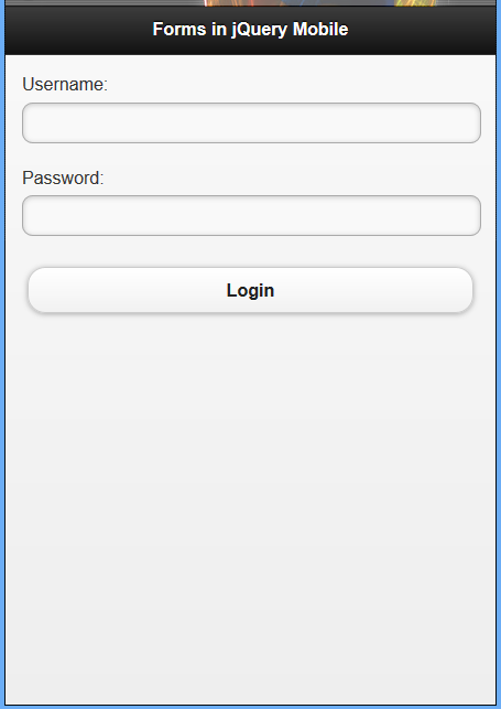
ENHANCING FORMS WITH JQUERY MOBILE
jQuery Mobile has exceptional support for forms on mobile devices. Each element has been restyled to be accessible and easily usable on a mobile device. Keep in mind that some of the form styles vary slightly depending on the platform and mobile browser that you are using.
Standard input Elements
Example 62: Simple login form built using jQuery mobile
!DOCTYPE html
html
head
  titleScript-Tutorials: Forms with jQuery Mobile/title
  meta name="viewport" content="width=device-width, initial-scale=1"
  link rel="stylesheet" href="http://code.jquery.com/mobile/1.1.0/jquery.mobile-1.1.0.min.css" /
  script src="http://code.jquery.com/jquery-1.7.1.min.js"/script
  script src="http://code.jquery.com/mobile/1.1.0/jquery.mobile-1.1.0.min.js"/script
/head
body
  div data-role="page"
    div data-role="header"
      h1Forms in jQuery Mobile/h1
    /div
    div data-role="content"
      form id="login" name="login" action="login.php" method="POST"
        label for="username"Username: /label
        input type="text" name="username" id="username" value="" /
        br /
        label for="password"Password:/label
        input type="password" name="password" id="password" value="" /
        br /
        input type="hidden" name="hiddenInput" id="hiddenInput" value="secret message" /
        input type="submit" name="loginSubmit" id="loginSubmit" value="Login" /
      /form
    /div
  /div
/body
/html
Example 63: Using jQuery mobile data-role=”fieldcontain” attribute to align elements in a simple login form
The image below shows the image of aligned element of a simple login form 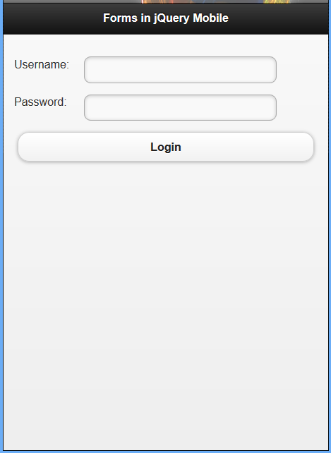 Notice that a little changes was done in our previous codes.
View the code below
!DOCTYPE html
html
head
  titleScript-Tutorials: Forms with jQuery Mobile/title
  meta name="viewport" content="width=device-width, initial-scale=1"
  link rel="stylesheet" href="http://code.jquery.com/mobile/1.1.0/jquery.mobile-1.1.0.min.css" /
  script src="http://code.jquery.com/jquery-1.7.1.min.js"/script
  script src="http://code.jquery.com/mobile/1.1.0/jquery.mobile-1.1.0.min.js"/script
/head
body
  div data-role="page"
    div data-role="header"
      h1Forms in jQuery Mobile/h1
    /div
    div data-role="content"
      form id="login" name="login" action="login.php" method="POST"
        div data-role="fieldcontain"
          label for="username"Username: /label
          input type="text" name="username" id="username" value="" /
          br /
        /div
        div data-role="fieldcontain"
          label for="password"Password:/label
          input type="password" name="password" id="password" value="" /
          br /
        /div
        input type="hidden" name="hiddenInput" id="hiddenInput" value="secret message" /
        input type="submit" name="loginSubmit" id="loginSubmit" value="Login" /
      /form
    /div
  /div
/body
/html
Now that we’ve seen the use of text elements, let’s take a look at some other input elements styled with jQuery Mobile.
RADIO BUTTONS AND CHECK BOXES
Radio buttons are useful when you want to present more than one option to the user but have the user select only one of them. They remind me of multiple-choice tests, or those “fill in the bubble” forms. jQuery Mobile takes radio buttons a bit further than your standard radio button by using the label element to display the radio button on a touch-friendly bar.
To create a radio button you start with an input element and then use an attribute of type="radio". You also want to give your radio button the value and id attributes. To make multiple radio buttons work together, you must give them all the same name. Your radio button should look similar to the following snippet: input type="radio" name="radio-1" id="radio-1" value="Option 1" /
You can group radio buttons together inside a div or a fieldset using a controlgroup, and they will display without any breaks between them. If you use the fieldset element, you can also use the legend element to give a description for the group.
If you want your radio buttons to appear horizontally you can use an attribute of data-role="controlgroup" and the attribute data-type="horizontal". This, however, makes your radio buttons appear as a row of standard buttons instead of a row of radio buttons.
Check boxes are similar to radio buttons, but they allow the user to select as many of the options as they want instead of just one. Just like radio buttons, you must include a label element for each checkbox element as jQuery Mobile uses it to create the touch-friendly bar. To create a check box you start with an input element and add an attribute of type="checkbox". Your check box should look similar to the following snippet:
input type="checkbox" name="checkbox-1" id="checkbox-1" /
You can group check boxes together by using a container element with an attribute of data-role="controlgroup".
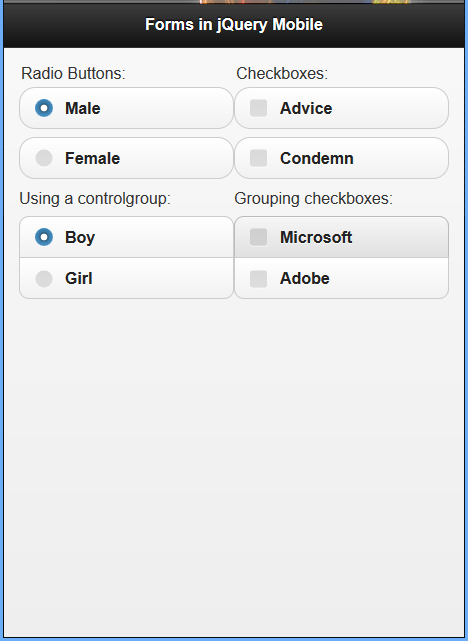
Creating Radio Buttons and Check Boxes in a Form using jQuery mobile
Example 64: Creating radio buttons and check boxes in a form using jQuery mobile
!DOCTYPE html
html
head
  titleScript-Tutorials: Forms with jQuery Mobile/title
  meta name="viewport" content="width=device-width, initial-scale=1"
  link rel="stylesheet" href="http://code.jquery.com/mobile/1.1.0/jquery.mobile-1.1.0.min.css" /
  script src="http://code.jquery.com/jquery-1.7.1.min.js"/script
  script src="http://code.jquery.com/mobile/1.1.0/jquery.mobile-1.1.0.min.js"/script
/head
body
  div data-role="page"
    div data-role="header"
      h1Forms in jQuery Mobile/h1
    /div
    div data-role="content"
      form id="login" name="login" action="login.php" method="POST"
        div class="ui-grid-a"
          div class="ui-block-a"
            fieldset
              legendRadio Buttons:/legend
              input type="radio" name="radio-group-1" id="radio1" value="Male" checked="checked" /
              label for="radio1"Male/label
              input type="radio" name="radio-group-1" id="radio2" value="Female" /
              label for="radio2"Female/label
            /fieldset
            fieldset data-role="controlgroup"
              legendUsing a controlgroup:/legend
              input type="radio" name="radio-group-2" id="radio3" value="Boy" checked="checked" /
              label for="radio3"Boy/label
              input type="radio" name="radio-group-2" id="radio4" value="Girl" /
              label for="radio4"Girl/label
            /fieldset
          /div
          div class="ui-block-b"
            fieldset
              legendCheckboxes:/legend
              input type="checkbox" name="checkbox-1" id="checkbox-1" /
              label for="checkbox-1"Advice/label
              input type="checkbox" name="checkbox-2" id="checkbox-2" /
              label for="checkbox-2"Condemn/label
            /fieldset
            fieldset data-role="controlgroup"
              legendGrouping checkboxes:/legend
              input type="checkbox" name="checkbox-3" id="checkbox-3" /
              label for="checkbox-3"Microsoft/label
              input type="checkbox" name="checkbox-4" id="checkbox-4" /
              label for="checkbox-4"Adobe/label
            /fieldset
          /div
        /div
      /form
    /div
  /div
/body
/html
THE SELECT ELEMENT
The select element is a little different from the previous elements because it doesn’t extend the input element. Instead it acts like a container for option elements. Each option element has a value and contains some text. The text for each option element appears when the select element is clicked or tapped. When the user is shown the list of option elements and selects one of them, the value within the selected option element becomes the value of the select element.
With jQuery Mobile the select element is styled as a button with an arrow pointing down. It also takes up as much space as is available and can be used with a container that has an attribute of data-role="fieldcontain" to place the label and select elements on the same line (if there is enough space onscreen).
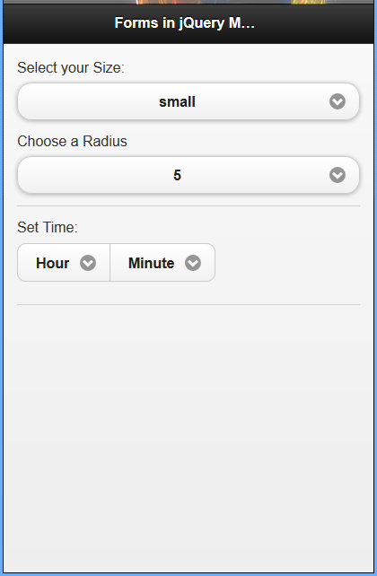
Using the select Element with jQuery Mobile
Example 65: Using jQuery mobile to create select element in a form
!DOCTYPE html
html
head
  titleScript-Tutorials: Forms with jQuery Mobile/title
  meta name="viewport" content="width=device-width, initial-scale=1"
  link rel="stylesheet" href="http://code.jquery.com/mobile/1.1.0/jquery.mobile-1.1.0.min.css" /
  script src="http://code.jquery.com/jquery-1.7.1.min.js"/script
  script src="http://code.jquery.com/mobile/1.1.0/jquery.mobile-1.1.0.min.js"/script
/head
body
  div data-role="page"
    div data-role="header"
      h1Forms in jQuery Mobile/h1
    /div
    div data-role="content"
      form id="login" name="login" action="login.php" method="POST"
        label for="size-select"Select your Size:/label
        select name="size-select" id="size-select"
          option value="small"small/option
          option value="medium"medium/option
          option value="large"large/option
        /select
        div data-role="fieldcontain"
          label for="radius-select"Choose a Radius/label
          select name="radius-select" id="radius-select"
            option value="radius-5"5/option
            option value="radius-15"15/option
            option value="radius-25"25/option
          /select
        /div
        div data-role="fieldcontain"
          fieldset data-role="controlgroup" data-type="horizontal"
            legendSet Time:/legend
            label for="hour-select"Hour/label
            select name="hour-select" id="hour-select"
              optionHour/option
              option value="hour-08"08/option
              option value="hour-09"09/option
              option value="hour-10"10/option
            /select
            label for="minute-select"Minute/label
            select name="minute-select" id="minute-select"
              optionMinute/option
              option value="minute-10"10/option
              option value="minute-20"20/option
              option value="minute-30"30/option
            /select
          /fieldset
        /div
      /form
    /div
  /div
/body
/html
EXTENDED INPUT ELEMENTS
Mobile devices have a few new ways of collecting user input. Some of these ways have existed with desktop browsers for quite some time, but they are not used enough to be considered common.
When thinking about the various control or input features of a mobile device, often included is a slider to change settings, a flip toggle switch to change from one setting to another, and a search feature. All three of these are supported in jQuery Mobile.
SLIDER
The slider is typically used on pages where a user would click and drag or tap and drag to select a value rather than type it. This makes the slider great for use as a volume control, brightness or opacity control and even for use on pages that perform calculations. Take a look at the following code and see whether you can tell what each attribute does.
input type="range" name="slider" id="slider" value="10" min="0" max="100" /
The attribute type="range" is what jQuery Mobile looks for to create the slider, and yes even though it is a type="range", it is still called a slider. There isn’t anything special about the name and id attributes; they work just like they do with other input elements. The value attribute, however, is important because it sets where the slider button or handle starts. The min attribute sets how low the slider can go, while the max attribute sets how high the slider is allowed to go.
You should use a label with each slider you include on your page. This should be done not only for display and accessibility reasons, but also because it is required when using jQuery Mobile.
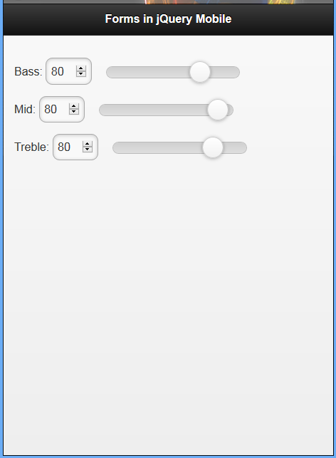
Using Sliders Inside a Form
Example 66: Using jQuery mobile to add sliders inside a form
!DOCTYPE html
html
head
  titleScript-Tutorials: Forms with jQuery Mobile/title
  meta name="viewport" content="width=device-width, initial-scale=1"
  link rel="stylesheet" href="http://code.jquery.com/mobile/1.1.0/jquery.mobile-1.1.0.min.css" /
  script src="http://code.jquery.com/jquery-1.7.1.min.js"/script
  script src="http://code.jquery.com/mobile/1.1.0/jquery.mobile-1.1.0.min.js"/script
/head
body
  div data-role="page"
    div data-role="header"
      h1Forms in jQuery Mobile/h1
    /div
    div data-role="content"
      form id="volume" name="volume" action="volume.php"
        div data-role="fieldcontain"
          labelBass:/label
          input type="range" name="" id="" min="10" max="110" value="80" /
        /div
        div data-role="fieldcontain"
          labelMid:/label
          input type="range" name="" id="" min="0" max="90" value="80" /
        /div
        div data-role="fieldcontain"
          labelTreble:/label
          input type="range" name="" id="" min="5" max="105" value="80" /
        /div
      /form
    /div
  /div
/body
/html
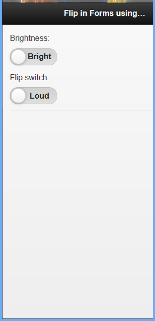
FLIP TOGGLE SWITCH
The flip toggle switch is pretty much a binary toggle. Either it is turned on, or it is turned off. This is common in settings where you turn various parts of your mobile device on or off. To create a flip toggle switch you need to start with a select element that has two option elements. You then need to add an attribute of data-role="slider" to the select element. Just like the other input elements, you can also wrap the flip toggle switch inside a container with the data-role="fieldcontain" to keep the label and the flip toggle switch on the same line (if space is available).
Example 67: Using jQuery mobile to create flip toggle switch
!DOCTYPE html
html
head
  titleScript-Tutorials: Forms with jQuery Mobile/title
  meta name="viewport" content="width=device-width, initial-scale=1"
  link rel="stylesheet" href="http://code.jquery.com/mobile/1.1.0/jquery.mobile-1.1.0.min.css" /
  script src="http://code.jquery.com/jquery-1.7.1.min.js"/script
  script src="http://code.jquery.com/mobile/1.1.0/jquery.mobile-1.1.0.min.js"/script
/head
body
  div data-role="page"
    div data-role="header"
      h1Flip in Forms using jQuery Mobile/h1
    /div
    div data-role="content"
      form id="flip" name="flip" action="flipswitch.php"
        label for="flip-1"Brightness:/label
        select name="flip-1" id="flip-1" data-role="slider"
          option value="Bright"Bright/option
          option value="Dark"Dark/option
        /select
        div data-role="fieldcontain"
          label for="flip-2"Flip switch:/label
          select name="flip-2" id="flip-2" data-role="slider"
            option value="Loud"Loud/option
            option value="Silent"Silent/option
          /select
        /div
      /form
    /div
  /div
/body
/html
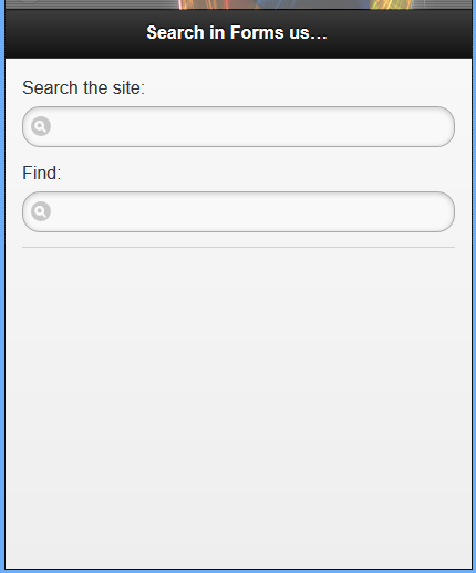
SEARCH INPUT
The search input is a new type of input that is part of the HTML5 specifications. This input is an enhanced text field that has an icon to help users know what it is for. When the user starts typing an “x” icon appears that when tapped or clicked erases all the user text entry in the field.
To create a search input, use the following one-line snippet: input type="search" name="search-input" id="search-input" value="" /
As with the other elements we’ve covered this hour, be sure to include a label to increase your form accessibility. You can also use a container with data-role="fieldcontain" to keep the label and search input on the same line when enough room is available onscreen.
Example 68: Creating search input using jQuery mobile
!DOCTYPE html
html
head
  titleScript-Tutorials: Forms with jQuery Mobile/title
  meta name="viewport" content="width=device-width, initial-scale=1"
  link rel="stylesheet" href="http://code.jquery.com/mobile/1.1.0/jquery.mobile-1.1.0.min.css" /
  script src="http://code.jquery.com/jquery-1.7.1.min.js"/script
  script src="http://code.jquery.com/mobile/1.1.0/jquery.mobile-1.1.0.min.js"/script
/head
body
  div data-role="page"
    div data-role="header"
      h1Search in Forms using jQuery Mobile/h1
    /div
    div data-role="content"
      form id="search-form" name="search-form" action="search.php" method="get"
        label for="search-1"Search the site:/label
        input type="search" name="search-1" id="search-1" value="" /
        div data-role="fieldcontain"
          label for="search-2"Find:/label
          input type="search" name="search-2" id="search-2" value="" /
        /div
      /form
    /div
  /div
/body
/html
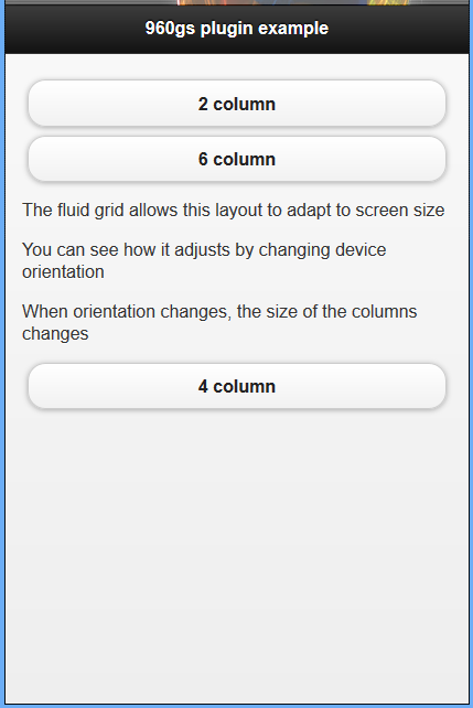
USING PLUG-INS
Because plug-ins covers anything that is added to the base library, they can be included through different means. Some plug-ins are JavaScript files that you include along with jQuery Mobile, and others are additional CSS files. We’re going to take a quick look at using the 960 grid plug-in with a page that is using jQuery Mobile.
The 960 grid is a popular grid system that is in use on desktop websites. It allows pages to be flexible and allows content to grow and shrink based on the viewable space of the browser. The jQuery Mobile port of the 960 grid plug-in for this system can be found at http://jeromeetienne.github.com/jquery-mobile-960/.
Example 69: Using jQuery mobile plugins in the standard html markup settings
!DOCTYPE html
html
head
  titleDeveloping with jQuery Mobile/title
  meta name="viewport" content="width=device-width, initial-scale=1"
  link rel="stylesheet" href="http://code.jquery.com/mobile/1.1.0/jquery.mobile-1.1.0.min.css" /
  link rel="stylesheet" href="http://jeromeetienne.github.com/jquery-mobile-960/css/jquery-mobile-fluid960.min.css" /
  script src="http://code.jquery.com/jquery-1.7.1.min.js"/script
  script src="http://code.jquery.com/mobile/1.1.0/jquery.mobile-1.1.0.min.js"/script
/head
body
  div data-role="page"
    div data-role="header"
      h1960gs plugin example/h1
    /div
    div data-role="content"
      div class="container_12"
        div class="grid_2"a href="#" data-role="button"2 column/a
        /div
        div class="grid_6"
          a href="#" data-role="button"6 column/a
          pThe fluid grid allows this layout to adapt to screen size/p
          pYou can see how it adjusts by changing device orientation/p
          pWhen orientation changes, the size of the columns changes/p
        /div
        div class="grid_4"
          a href="#" data-role="button"4 column/a
        /div
      /div
    /div
  /div
/body
/html
DEMOS: Simple but Responsive Site Layout in query
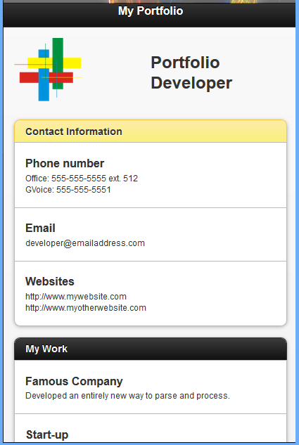
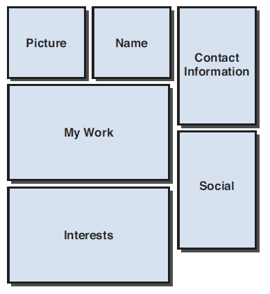
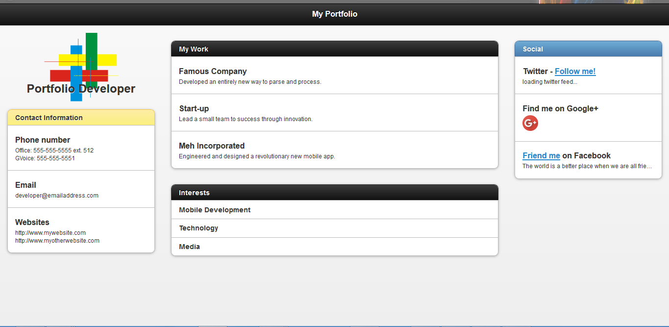
Demo 1: A Mobile Portfolio Site layout and preview
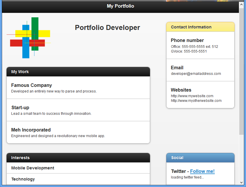
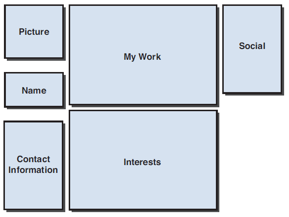
Demo 2: tablet layout
Demo 3: Desktop layout
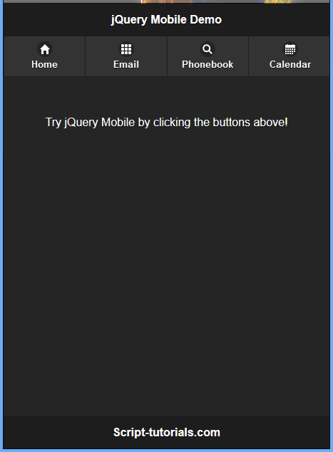
Demo 4: Basic jQuery mobile example


