In a new series of articles, we will talk about jQuery Mobile framework, which easily allows you to create responsive mobile websites.
GETTING STARTED WITH jQuery MOBILE
WHAT IS JQUERY MOBILE
jQuery Mobile is a reliable support for all the abundance of mobile development kits and tools that makes a mobile site responsive, flexible and simple.
jQuery Mobile is fundamentally be defined as a set of jQuery plug-ins and widgets that aim to provide a cross platform API for creating mobile web applications.
In terms of code implementation, jQuery Mobile is very similar to jQuery UI, but while jQuery UI is focused on desktop applications, jQuery Mobile is built with mobile devices in mind.
‘A MUST KNOW’ ABOUT CREATING A MOBILE WEB
While developing a mobile web bear these three key words in mind, which that a mobile web MUST be
- Responsive
- Flexible
- Simple
- Responsiveness entails how a page looks when it transits; a button is tapped and how content loads on mobile.
- Flexibility entails that mobile web should be free customizable by the user to suits his/her desire
- Simplicity means that a mobile should be site an easy navigating site.
A MUST KNOW ABOUT jQuery MOBILE FOR DEVELOPERS
jQuery have made a great impact in the emerging world of fascinating web development and designing, changed the way developers implement and use JavaScript on websites and web applications that Microsoft has chosen it as a preferred javascript framework, and Microsoft has included full auto-completion support for jQuery inside visual studio therefore JQuery mobile an extract /extension of/in the amazing jQuery library is supportive and reliable.
WHY JQUERY MOBILE {NEED TO KNOW jQuery MOBILE AS A DEVELOPER}
As I have illustrated in ‘a must know about jQuery mobile for developers‘; As mobile device generation emerges so as the need for mobile responsive, flexible and simple web application grows therefore the need and demand for jQuery mobile (jQuery frame work) rapidly increases, and now is a great time for you guru or beginner in mobile web API to jump in and get involved with the project.
DEVICE THAT CAN RUN jQUERY MOBILE
Running of jQuery on different device depends on the browser and operating system.
Browsers that support jQuery mobile are those modern browsers that have support for HTML5 tags and some CSS 3 supports.
The devices that support jQuery mobile are desktop, laptop, all-in-one systems, tablets, Smartphones, Android, ios, Blackberry (high version), webOS, Windows mobile and eReader Devices. jQuery mobile supports kindle devices that include the experimental webkit-based browser.
WHAT AN ADVANCE OR AN AMATURE DEVELOPER NEEDS FOR CREATING MOBILE SITE USING jQuery MOBILE
1. Development applications to use
Development application for windows include Komodo IDE, eclipse, iWeb, Microsoft FrontPage, Aptana studio, Dreamweaver, notepad++. We are using Dreamweaver in this tutorial
Development applications for OsX include Coda, espresso, textwrangler, kod
2. The language the mobile web developer should or should have known are HTML5, CSS 3 and Javascript.
jQuery Mobile consists of four files: a JavaScript file, a CSS file, and two PNG graphic sprites.
The JavaScript file is meant to be loaded after the base jQuery library. This script file performs various tasks, like creating widgets, applying event listeners, and enabling the API.
A Cascading Style Sheet (CSS) which specifies layout and appearance of jQuery Mobile page elements. The Style Sheet also specifies transitions and animations with CSS3 transforms.
You can download the entire jQuery Mobile package (the JavaScript library, the CSS, and the graphics) or you can access them through the project’s CDN. See the jQuery Mobile project download page for specifics. In our examples for this tutorial, we will be using the CDN.
THE DOCTYPE FOR BUILDING HTML CONTENT FOR MOBILE SITE
HTML4 TRANSITIONAL DOCTYPE
Developers who are still satisfied using deprecated HTML tags but want to move on to HTML 4 can use the transitional DOCTYPE which allows the browser to parse through deprecated tags and displays without throwing any errors.
!DOCTYPE HTML PUBLIC "-//W3C//DTD HTML 4.01 Transitional//EN" "http://www.w3.org/TR/html4/loose.dtd"
Fig 1.1 section 1.1 – html 4 transitional doctype
HTML4 STRICT DOCTYPE
Developers who do not want to include support for deprecated tags and the possible formatting errors that may ensue when using a ‘compatibility’ mode can use the strict DOCTYPE which tells the browser to throw errors when deprecated tags are included in the HTML file it is trying to load. This can be useful as it guarantees your work is at least up to the HTML 4 standard.
!DOCTYPE HTML PUBLIC "-//W3C//DTD HTML 4.01//EN" "http://www.w3.org/TR/html4/scrict.dtd"
Fig 1.2 section 1.1 – html 4 strcit doctype
HTML5 DOCTYPE
Using the HTML5 DOCTYPE works on almost all legacy browsers and is already in use on many websites today.
To use the HTML5 DOCTYPE in your HTML file, use the following snippet:
!DOCTYPE html
Fig 1.3 section 1.1 – html 5 doctype
BASIC SITE STRUCTURE USING HTML5 DOCTYPE
!DOCTYPE html
html
headtitle/title/head
body/body
/html
Fig 1.4 section 1.1 – basic site structure using html 5 doctype
WORKING WITH HTML5 STRUCTURE, CSS AND JAVASCRIPT
BUILDING AND PRESENTING CONTENT IN HTML5
!DOCTYPE html
html
head
  titleTitles should be short descriptions of the page/title
  meta charset="utf-8"
/head
body
  div
    h1h1 tags should contain the most important information on your site/h1
    pParagraph tags should be where most of your text content lives, or used as a separation between sections./p
    ul
      liThis is a list element/li
      liThis is another element, notice the bullets and indentation /li
    /ul
    pYou probably noticed that I used a "div" tag to wrap these other tags in. I'm using it as a container./p
  /div
/body
/html
Fig 1.5 section 1.2 – building and presenting content in html 5
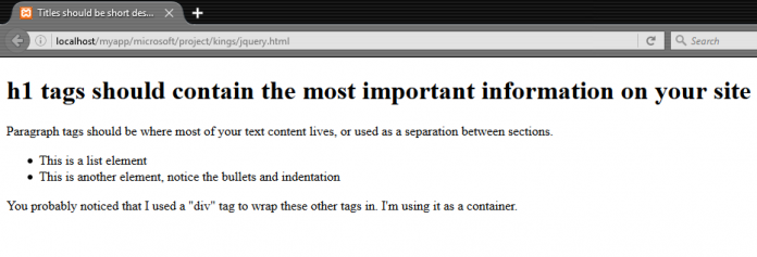
We know what the code does, but let’s take a look at what it actually looks like. The image below shows what the rendered HTML looks like.
Fig 1.6 section 1.2 – browser preview of building and presenting content in html 5
CSS IN BUILDING AND PRESENTING CONTENT IN HTML5
Just after the title /title tags press enter and insert snippet as shown in the preceding image link a stylesheet file .css to the main .html file
Fig 1.7 section 1.2 – linking css to Html 5 in building and presenting web content
The below following script are found in the css file [hist.css]
@charset "utf-8";
/* CSS Document */
body {
  background:
  font-family: Helvetica, Arial, sans-serif;
  font-size: 0.75em;
}
h1 {
  font-size: 200%
}
p {
  margin: 5px 0;
  padding: 0 3px;
}
#year{
  text-align:center;
  font-weight:bold;
  font-size:200%;
}
.small {
  font-size: 80%;
}
Fig 1.8 section 1.2 – linking css to Html 5 in building and presenting web content
The image below shows what the rendered HTML will now look like after linking the .CSS file.
Fig 1.9 section 1.2 – rendered HTML browser preview after linking the .CSS file.
JAVASCRIPT IN BUILDING AND PRESENTING CONTENT IN HTML5
A summary of placing JavaScript tags in your document:
Loading scripts in the head element makes them load first but can adversely affect the perceived load time.
Loading scripts inside the body may seem like a good idea but creates issues with maintenance and throws possible loading delays.
Loading scripts just before the closing body tag makes your site appear to load quickly but may have an unintended consequence of missing site functionality for up to the first few seconds.
Let’s practice using LOADING SCRIPTS IN THE HEAD which is the most preferable for every developer
  script src="js/javascript.js" type="text/javascript"/script
/head
Fig 1.10 section 1.2 – loading javascript scripts in the head of html5
The below following script are found in the .js file [javascript.js]
// JavaScript Document
window.onload = setYear;
function setYear() {
  var currentYear = new Date();
  document.getElementById('year').innerHTML = currentYear.getFullYear();
}
Fig 1.11 section 1.2 – loading javascript scripts in the head of html5
The image below shows what the rendered HTML will now look like after linking the .js file.
Fig 1.12 section 1.2 – rendered html look after loading .js scripts files in the head of html5
We just learned a little about current use of structuring HTML, linking CSS and loading Script (javascript) now lets get to know how to use our current learned skill in jQuery mobile


