


 Advertising Campaign Budget Tips")
 Tips For Small Business")


Our fourth jQuery Mobile tutorial. In this section we continue talking about using various data- attributes, linking external pages, using grid system, building collapsible content. Also we will tell how to make footer, header, navbar and so on. Everything is supported with code snippets.
EXTERNAL PAGES
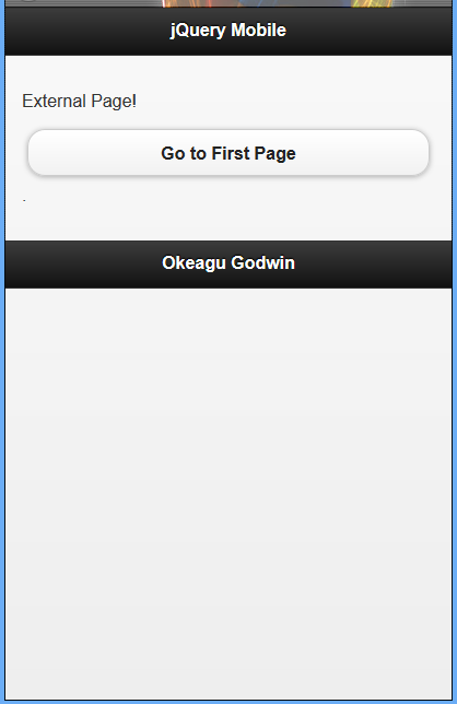
jQuery Mobile will also handle external pages as well. If you link to a separate page instead of to an ID of a data-role="page" element within the current document, jQuery Mobile will perform an asynchronous fetch of the requested page and integrate it into the current document, allowing it to perform its page management functions.
To add an external page to our previous example code, create a file called ‘expage.html’ and include the markup shown then change the link in markup of the third page
pa href="#page1" data-role="button"Go back to First Page/a/p
to this one
pa href="expage.html" data-role="button"Go to external Page/a/p
Example 22: Linking of an external page
!DOCTYPE html
html
head
meta charset="utf-8" /
/head
body
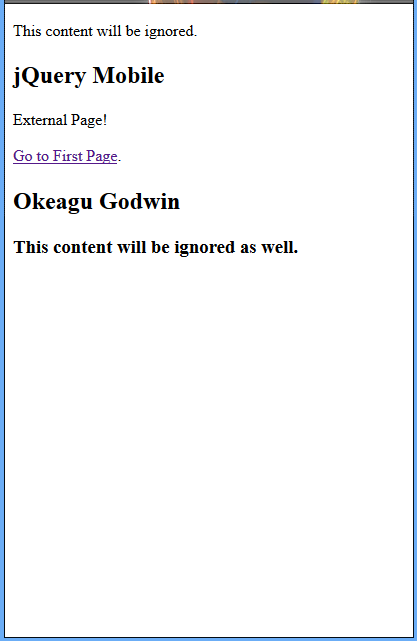
pThis content will be ignored./p
!-- Begin Page 4 --
section id="page4" data-role="page"
header data-role="header"
h1jQuery Mobile/h1
/header
div class="content" data-role="content"
pExternal Page!/p
pa href="#page1" data-role="button"Go to First Page/a./p
/div
footer data-role="footer"
h1footer/h1
/footer
/section
!-- End Page 4--
h3This content will be ignored as well./h3
/body
/html
When you preview this script you will see the image to the left but when you navigate from the previous page of the previous script will see the image right.
OVERRIDING ASYNCHRONOUS PAGE FETCHING
Sometimes you will want to actually load a page normally, rather than having jQuery Mobile fetch it asynchronously and integrate it into the current DOM. You can override the AJAX loading in two ways: specifying a target attribute on a link (such as "_blank") or by specifying a rel="external" attribute on the link.
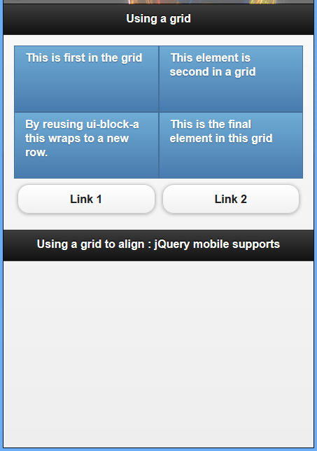
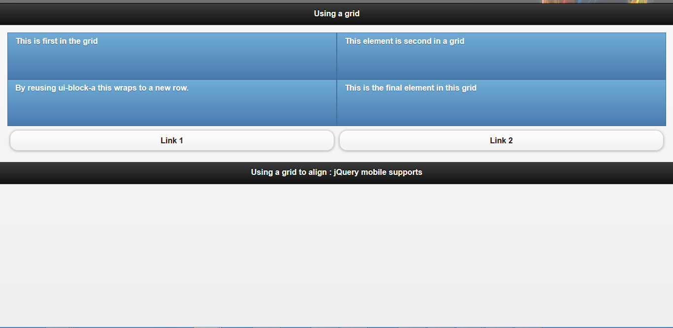
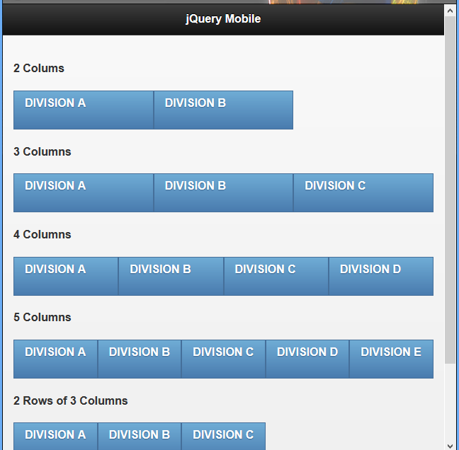
ALIGNING CONTENT WITH A GRID
A grid is just what it sounds like. It is a tool for placing objects to make them align. jQuery Mobile uses a grid system to help with content alignment. This system is useful as it helps to create a cross-device experience that takes the guesswork out of dealing with devices that have different dimensions than you originally planned for.
The grid system in jQuery Mobile allows you to create columns of equal width. To apply the grid system to your content you need to add a class to the container you want to use the grid, and a secondary class to the items inside the container.
Grid container classes are as follows:
- ui-grid-a creates a two-column grid.
- ui-grid-b creates a three-column grid.
- ui-grid-c creates a four-column grid.
- ui-grid-d creates a five-column grid.
Content classes are as follows:
- ui-block-a is used on the first block.
- ui-block-b is used on the second block.
- ui-block-c is used on the third block.
- ui-block-d is used on the fourth block.
- ui-block-e is used on the fifth block.
When using a grid on a container that has elements with content that is wider than the available screen resolution, the content will be moved into a new row in the grid. This helps keep content organized and viewable.
Aligning Buttons and boxes of content on a Page Using a Grid
Example 23: aligning content with a grid line
!DOCTYPE html
html
head
  titleScript-Tutorials: Using a grid/title
  meta name="viewport" content="width=device-width, initial-scale=1"
  link rel="stylesheet" href="http://code.jquery.com/mobile/1.1.0/jquery.mobile-1.1.0.min.css" /
  script src="http://code.jquery.com/jquery-1.7.1.min.js"/script
  script src="http://code.jquery.com/mobile/1.1.0/jquery.mobile-1.1.0.min.js"/script
/head
body
  div id="page1" data-role="page"
    div data-role="header"
      h1Using a grid/h1
    /div
    div data-role="content"
      div class="ui-grid-a"
        div class="ui-block-a"
          p class="ui-bar ui-bar-b" style="height: 80px;"
            This is first in the grid
          /p
        /div
        div class="ui-block-b"
          p class="ui-bar ui-bar-b" style="height: 80px;"
            This element is second in a grid
          /p
        /div
        div class="ui-block-a"
          p class="ui-bar ui-bar-b" style="height: 80px;"
            By reusing ui-block-a this wraps to a new row.
          /p
        /div
        div class="ui-block-b"
          p class="ui-bar ui-bar-b" style="height: 80px;"
            This is the final element in this grid
          /p
        /div
      /div
      div class="ui-grid-a"
        div class="ui-block-a"
          a href="#" data-role="button"Link 1/a
        /div
        div class="ui-block-b"
          a href="#" data-role="button"Link 2/a
        /div
      /div
    /div
    div data-role="footer"
      h4Using a grid to align : jQuery mobile supports/h4
    /div
  /div
/body
/html
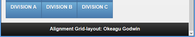
Large devices still show content aligned in a grid; the content will just be stretched out to take advantage of the screen space.
GRIDS LAYOUT
As we have illustrated in the above preceding example grids Layout are based on a div structure: create a div to contain the grid, and then add the cell divs inside.
Multiple rows are handled by adding more cell divs, which should be classed so that each column should have its own ui-block class.
The containing div is given a class ui-grid class: ui-grid-a for 2 columns, ui-grid-b for three columns, and so forth, all the way to ui-grid-d for 5 columns.
Cell divs are given ui-block classes based on their order: ui-block-a for first, ui-block-b for second, and so forth, all the way up to ui-block-e for fifth.
Example 24: Grid layout in mobile site using jQuery mobile
!DOCTYPE html
html
head
  titleScript-tutorials: Grid layout with jQuery Mobile/title
  meta name="viewport" content="width=device-width, initial-scale=1"
  link rel="stylesheet" href="http://code.jquery.com/mobile/1.1.0/jquery.mobile-1.1.0.min.css" /
  script src="http://code.jquery.com/jquery-1.7.1.min.js"/script
  script src="http://code.jquery.com/mobile/1.1.0/jquery.mobile-1.1.0.min.js"/script
/head
body
  section id="page1" data-role="page"
    header data-role="header"
      h1jQuery Mobile/h1
    /header
    div class="content" data-role="content"
      h42 Colums/h4
      div class="ui-grid-b"
        div class="ui-block-a"
          p class="ui-bar ui-bar-b" style="height: 40px;"DIVISION A/p
        /div
        div class="ui-block-b"
          p class="ui-bar ui-bar-b" style="height: 40px;"DIVISION B/p
        /div
      /div
      h43 Columns/h4
      div class="ui-grid-b"
        div class="ui-block-a"
          p class="ui-bar ui-bar-b" style="height: 40px;"DIVISION A/p
        /div
        div class="ui-block-b"
          p class="ui-bar ui-bar-b" style="height: 40px;"DIVISION B/p
        /div
        div class="ui-block-c"
          p class="ui-bar ui-bar-b" style="height: 40px;"DIVISION C/p
        /div
      /div
      h44 Columns/h4
      div class="ui-grid-c"
        div class="ui-block-a"
          p class="ui-bar ui-bar-b" style="height: 40px;"DIVISION A/p
        /div
        div class="ui-block-b"
          p class="ui-bar ui-bar-b" style="height: 40px;"DIVISION B/p
        /div
        div class="ui-block-c"
          p class="ui-bar ui-bar-b" style="height: 40px;"DIVISION C/p
        /div
        div class="ui-block-d"
          p class="ui-bar ui-bar-b" style="height: 40px;"DIVISION D/p
        /div
      /div
      h45 Columns/h4
      div class="ui-grid-d"
        div class="ui-block-a"
          p class="ui-bar ui-bar-b" style="height: 40px;"DIVISION A/p
        /div
        div class="ui-block-b"
          p class="ui-bar ui-bar-b" style="height: 40px;"DIVISION B/p
        /div
        div class="ui-block-c"
          p class="ui-bar ui-bar-b" style="height: 40px;"DIVISION C/p
        /div
        div class="ui-block-d"
          p class="ui-bar ui-bar-b" style="height: 40px;"DIVISION D/p
        /div
        div class="ui-block-e"
          p class="ui-bar ui-bar-b" style="height: 40px;"DIVISION E/p
        /div
      /div
      h42 Rows of 3 Columns/h4
      div class="ui-grid-d"
        div class="ui-block-a"
          p class="ui-bar ui-bar-b" style="height: 40px;"DIVISION A/p
        /div
        div class="ui-block-b"
          p class="ui-bar ui-bar-b" style="height: 40px;"DIVISION B/p
        /div
        div class="ui-block-c"
          p class="ui-bar ui-bar-b" style="height: 40px;"DIVISION C/p
        /div
      /div
    /div
    footer data-role="footer"
      h1Alignment Grid-layou/h1
    /footer
  /section
/body
/html
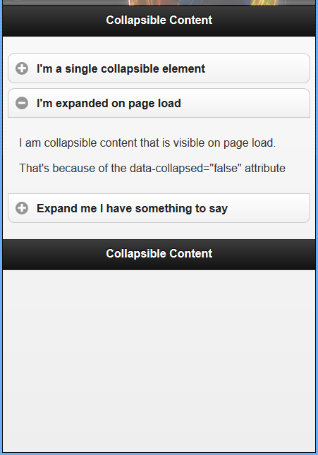
BUILDING COLLAPSIBLE CONTENT
Collapsible content can be hidden or shown with a click or a touch. You probably have already seen this type of behavior on websites before. You may have seen it in the Frequently Asked Questions sections on multiple sites. Usually on those sites it is a question or an answer with the title viewable and then a little ‘+’ or ‘-‘ next to it to show that it can be opened or closed. This same functionality is built into jQuery Mobile.
To create collapsible content, you just need to add data-role="collapsible" to the containing element that you want to make collapsible.
Example 25: Building a collapsible content
!DOCTYPE html
html
head
  titleScript-tutorials: Collapsible Content/title
  meta name="viewport" content="width=device-width, initial-scale=1"
  link rel="stylesheet" href="http://code.jquery.com/mobile/1.1.0/jquery.mobile-1.1.0.min.css" /
  script src="http://code.jquery.com/jquery-1.7.1.min.js"/script
  script src="http://code.jquery.com/mobile/1.1.0/jquery.mobile-1.1.0.min.js"/script
/head
body
  div id="page1" data-role="page"
    div data-role="header"
      h1Collapsible Content/h1
    /div
    div data-role="content"
      div data-role="collapsible"
        h3I'm a single collapsible element/h3
        pI'm the content inside of the single collapsible element./p
      /div
      div data-role="collapsible-set"
        div data-role="collapsible" data-collapsed="false"
          h3I'm expanded on page load/h3
          pI am collapsible content that is visible on page load./p
          pThat's because of the data-collapsed="false" attribute/p
        /div
        div data-role="collapsible"
          h3Expand me I have something to say/h3
          pI am closed on page load, but still part of an accordion./p
          div data-role="collapsible"
            h3Wait, are you nested?/h3
            pYes! You can even nest your collapsible content!/p
          /div
        /div
      /div
    /div
    div data-role="footer"
      h4Collapsible Content/h4
    /div
  /div
/body
/html
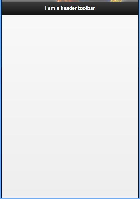
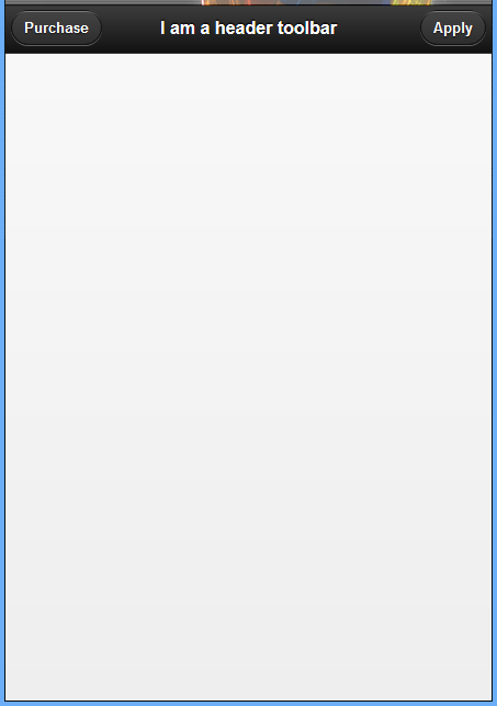
ADDING A HEADER TOOLBAR
Example 26: Setting up a header
!DOCTYPE html
html
head
  titleScript-tutorials: Header toolbar/title
  meta name="viewport" content="width=device-width, initial-scale=1"
  link rel="stylesheet" href="http://code.jquery.com/mobile/1.1.0/jquery.mobile-1.1.0.min.css" /
  script src="http://code.jquery.com/jquery-1.7.1.min.js"/script
  script src="http://code.jquery.com/mobile/1.1.0/jquery.mobile-1.1.0.min.js"/script
/head
body
  div data-role="page"
    div data-role="header"
      h1I am a header toolbar/h1
    /div
  /div
/body
/html
Adding a button to the header
Example 27: Adding a button to the header
!DOCTYPE html
html
head
  titleScript-tutorials: Header toolbar/title
  meta name="viewport" content="width=device-width, initial-scale=1"
  link rel="stylesheet" href="http://code.jquery.com/mobile/1.1.0/jquery.mobile-1.1.0.min.css" /
  script src="http://code.jquery.com/jquery-1.7.1.min.js"/script
  script src="http://code.jquery.com/mobile/1.1.0/jquery.mobile-1.1.0.min.js"/script
/head
body
  div data-role="page"
    div data-role="header" data-position="inline"
      !-- first link --
      a href="#"Purchase/a
      h1I am a header toolbar/h1
      !--second link --
      a href="#"Apply/a
    /div
  /div
/body
/html
Note that we did not have to apply a data-role to style the link as a button.
The link will be styled as a button automatically when it is inside the header toolbar.
The first link in the header toolbar always defaults to display on the left side of the header toolbar.
ATTACHING A NAVIGATION TOOLBAR
A navigation toolbar, or navbar, is a widget built into jQuery Mobile that allows you to add navigation links to your page.
Example 28: A page with a navbar inside the header toolbar
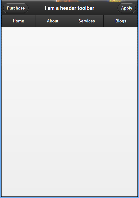
The container for the navbar being created as a div element with an attribute of data-role="navbar". Notice how the navbar is attached to the header toolbar by being created inside it.
The ul element that contains all the links we want inside of the navbar.
li elements that each contain a link.
!DOCTYPE html
html
head
  titleScript-tutorials: Header toolbar/title
  meta name="viewport" content="width=device-width, initial-scale=1"
  link rel="stylesheet" href="http://code.jquery.com/mobile/1.1.0/jquery.mobile-1.1.0.min.css" /
  script src="http://code.jquery.com/jquery-1.7.1.min.js"/script
  script src="http://code.jquery.com/mobile/1.1.0/jquery.mobile-1.1.0.min.js"/script
/head
body
  div data-role="page"
    div data-role="header" data-position="inline"
      !-- first link --
      a href="#"Purchase/a
      h1I am a header toolbar/h1
      !--second link --
      a href="#"Apply/a
      div data-role="navbar"
        ul
          lia href="#"Home/a
          /li
          lia href="#"About/a
          /li
          lia href="#"Services/a
          /li
          lia href="#"Blogs/a
          /li
        /ul
      /div
    /div
  /div
/body
/html
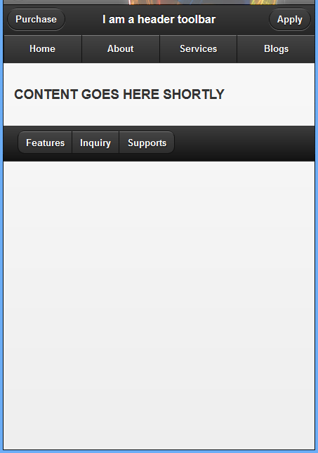
ADDING A FOOTER TOOLBAR
Just like the header toolbar, the footer toolbar is added by adding an attribute of data-role="footer" to a container element.
A Code Snippet for Setting Up a Footer Toolbar
div data-role="footer"

h4I am a footer toolbar/h4

/div
This snippet of code should be as familiar as the header toolbar was, as we have covered it before. Let’s do something new and switch up the footer toolbar by removing the h4 element and replacing it with a few buttons.
Example 29: Adding and aligning buttons using control group in the footer of a page
!DOCTYPE html
html
head
  titleScript-tutorials: Header toolbar/title
  meta name="viewport" content="width=device-width, initial-scale=1"
  link rel="stylesheet" href="http://code.jquery.com/mobile/1.1.0/jquery.mobile-1.1.0.min.css" /
  script src="http://code.jquery.com/jquery-1.7.1.min.js"/script
  script src="http://code.jquery.com/mobile/1.1.0/jquery.mobile-1.1.0.min.js"/script
/head
body
  div data-role="page"
    div data-role="header" data-position="inline"
      !-- first link --
      a href="#"Purchase/a
      h1I am a header toolbar/h1
      !--second link --
      a href="#"Apply/a
      div data-role="navbar"
        ul
          lia href="#"Home/a
          /li
          lia href="#"About/a
          /li
          lia href="#"Services/a
          /li
          lia href="#"Blogs/a
          /li
        /ul
      /div
    /div
    !--content --
    div data-role="content"
      h3CONTENT GOES HERE SHORTLY/h3
    /div
    !--adding footer to your page with tool bar --
    div data-role="footer" class="ui-bar"
      div data-role="controlgroup" data-type="horizontal"
        a href="#" data-role="button"Features/a
        a href="#" data-role="button"Inquiry/a
        a href="#" data-role="button"Supports/a
      /div
    /div
  /div
/body
/html
Example 30: Two aligning options that can be used to align the buttons in the footer toolbar are the following snippet of code
Example 31: Using a navbar in the Footer Toolbar
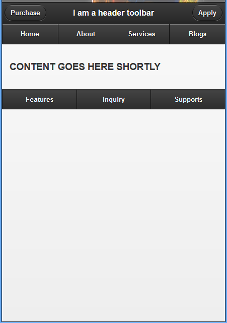
A navigation toolbar, or navbar, is a widget built into jQuery Mobile that allows you to add navigation links to your page. Similar to the built-in grid system, the navbar is capable of containing five columns. To add a navbar to your page, you must use a container element with an attribute of data-role="navbar". Inside the container you must have an unordered list with each column inside an li element.
!DOCTYPE html
html
head
  titleScript-tutorials: Header toolbar/title
  meta name="viewport" content="width=device-width, initial-scale=1"
  link rel="stylesheet" href="http://code.jquery.com/mobile/1.1.0/jquery.mobile-1.1.0.min.css" /
  script src="http://code.jquery.com/jquery-1.7.1.min.js"/script
  script src="http://code.jquery.com/mobile/1.1.0/jquery.mobile-1.1.0.min.js"/script
/head
body
  div data-role="page"
    div data-role="header" data-position="inline"
      !-- first link --
      a href="#"Purchase/a
      h1I am a header toolbar/h1
      !--second link --
      a href="#"Apply/a
      div data-role="navbar"
        ul
          lia href="#"Home/a
          /li
          lia href="#"About/a
          /li
          lia href="#"Services/a
          /li
          lia href="#"Blogs/a
          /li
        /ul
      /div
    /div
    !--content --
    div data-role="content"
      h3CONTENT GOES HERE SHORTLY/h3
    /div
    !--adding footer to your page with tool bar --
    div data-role="footer"
      div data-role="navbar"
        ul
          lia href="#"Features/a
          /li
          lia href="#"Inquiry/a
          /li
          lia href="#"Supports/a
          /li
        /ul
      /div
    /div
  /div
/body
/html
POSITIONING THE TOOLBARS
Toolbars are generally placed before and after the content section, as is standard in web development.
Sometimes though you may find yourself wanting the header and footer to stay visible all the time, especially when you are using a navbar. There are two different ways of doing this.
You can either use fixed or full screen positioning on the toolbar.
USING A FIXED POSITION
When using a fixed position, jQuery Mobile checks the page to see whether the positioned toolbar is already in view. If the toolbar is out of the view, it will be inserted into the document at the top or bottom of the viewable area (depending on whether it is a header or footer toolbar).
To make a toolbar use the fixed position, you need to add data-position="fixed" to the toolbar.
Example 31: Fixed positioned toolbar
The rendered html in browser when have not been scrolled 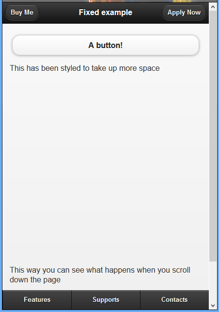
The rendered html in browser when have been scrolled 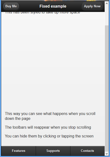
!DOCTYPE html
html
head
  titleScript-tutorials: Toolbars with jQuery Mobile/title
  meta name="viewport" content="width=device-width, initial-scale=1"
  link rel="stylesheet" href="http://code.jquery.com/mobile/1.1.0/jquery.mobile-1.1.0.min.css" /
  script src="http://code.jquery.com/jquery-1.7.1.min.js"/script
  script src="http://code.jquery.com/mobile/1.1.0/jquery.mobile-1.1.0.min.js"/script
/head
body
  div data-role="page"
    div data-role="header" data-position="fixed"
      a href="#"Buy Me/a
      h1Fixed example/h1a href="#"Apply Now/a
    /div
    div data-role="content"
      a href="#" data-role="button"A button!/a
      p style="height: 400px;"This has been styled to take up more space/p
      pThis way you can see what happens when you scroll down the page/p
      pThe toolbars will reappear when you stop scrolling/p
      pYou can hide them by clicking or tapping the screen/p
    /div
    div data-role="footer" data-position="fixed"
      div data-role="navbar"
        ul
          lia href="#"Features/a
          /li
          lia href="#"Supports/a
          /li
          lia href="#"Contacts/a
          /li
        /ul
      /div
    /div
  /div
/body
/html
USING A FULL SCREEN POSITION
The full screen position is closely related to the fixed position. The main difference is that the toolbars are placed above the page rather than be a part of it. This can create some navigation problems as links that would normally be available farther down or farther up the page from the toolbars are now sitting directly underneath them.
Full screen positions are good to use when you are displaying an image gallery or for showing videos. In these instances the controls can be put in the navbar, letting the user open and close the controls when they need them.
To use the full screen position you need to add data-fullscreen="true" to the div element that also has the attribute of data-role="page". You then need to make sure that both the header and footer toolbars contain data-position="fixed".
From the previous code that reads
div data-role="page"
We should change to now read
div data-role="page" data-fullscreen="true"
Example 32: Full screen positioned toolbar
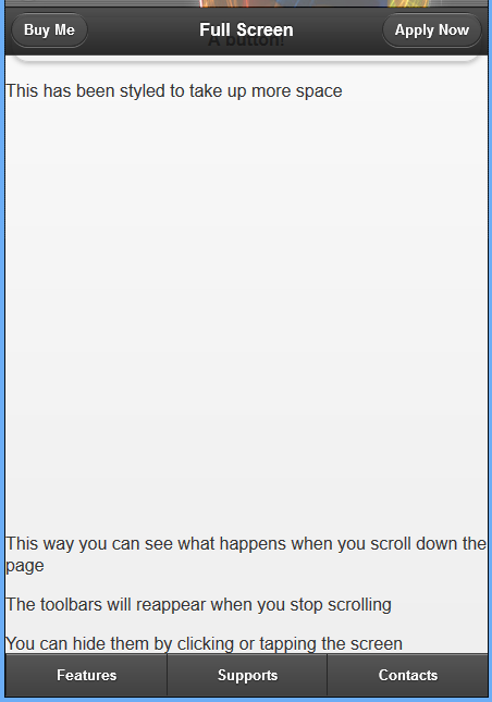 Remember that items covered by toolbars using the full screen position are still accessible by clicking or tapping somewhere on the screen to hide the toolbars.
!DOCTYPE html
html
head
  titleScript-tutorials: Toolbars with jQuery Mobile/title
  meta name="viewport" content="width=device-width, initial-scale=1"
  link rel="stylesheet" href="http://code.jquery.com/mobile/1.1.0/jquery.mobile-1.1.0.min.css" /
  script src="http://code.jquery.com/jquery-1.7.1.min.js"/script
  script src="http://code.jquery.com/mobile/1.1.0/jquery.mobile-1.1.0.min.js"/script
/head
body
  div data-role="page" data-fullscreen="true"
    div data-role="header" data-position="fixed"
      a href="#"Buy Me/a
      h1Full Screen /h1a href="#"Apply Now/a
    /div
    div data-role="content"
      a href="#" data-role="button"A button!/a
      p style="height: 400px;"This has been styled to take up more space/p
      pThis way you can see what happens when you scroll down the page/p
      pThe toolbars will reappear when you stop scrolling/p
      pYou can hide them by clicking or tapping the screen/p
    /div
    div data-role="footer" data-position="fixed"
      div data-role="navbar"
        ul
          lia href="#"Features/a
          /li
          lia href="#"Supports/a
          /li
          lia href="#"Contacts/a
          /li
        /ul
      /div
    /div
  /div
/body
/html
ADDING PERSISTENT NAVIGATION
A div element with the attributes of data-role="footer", data-position="fixed", and data-id="rps". The first two attributes are the required setup for creating a footer toolbar and using fixed positioning. The data-id=”rps” keeps navbar visible while the page is transitioning. This works only when the value inside the data-id attribute is the same on the current page and the one being transitioned to.
Example 31: Adding persistent navigation
Preview of features.html 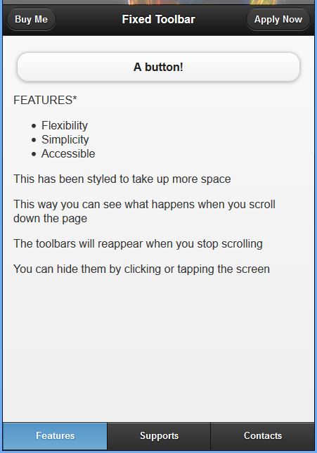 Preview of supports.html
 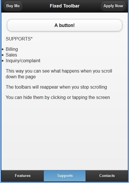 Preview of contacts.html
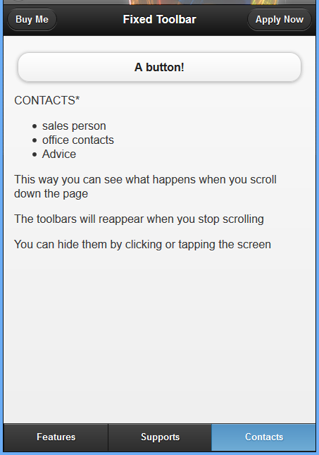
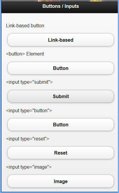
INPUTS AND BUTTONS
In HTML many types of input elements create buttons. Anytime that you use an input element with an attribute type having a value of submit, reset, button, or image it automatically is styled as a button.
With these input types being automatically styled as buttons, you do not need to add the data-role="button" attribute like you did when using a link-based button. Just in case you were wondering, the button element is also automatically styled as a button and does not require any extra markup.
Example 32: inputs and buttons (form elements)
!DOCTYPE html
html
head
  titleScript-tutorials: Buttons jQuery Mobile/title
  meta name="viewport" content="width=device-width, initial-scale=1"
  link rel="stylesheet" href="http://code.jquery.com/mobile/1.1.0/jquery.mobile-1.1.0.min.css" /
  script src="http://code.jquery.com/jquery-1.7.1.min.js"/script
  script src="http://code.jquery.com/mobile/1.1.0/jquery.mobile-1.1.0.min.js"/script
/head
body
  div data-role="page"
    div data-role="header"
      h1Buttons / Inputs/h1
    /div
    div data-role="content"
      pLink-based button/p
      a href="#" data-role="button"Link-based/a
      plt;buttongt; Element/p
      button type="button"Button/button
      plt;input type="submit"gt;/p
      input type="submit" value="Submit" /
      plt;input type="button"gt;/p
      input type="button" value="Button" /
      plt;input type="reset"gt;/p
      input type="reset" value="Reset" /
      plt;input type="image"gt;/p
      input type="image" value="Image" /
    /div
  /div
/body
/html
OVERRIDING BUTTON DEFAULTS
By default, buttons are given a certain appearance. While this appearance looks good on most mobile devices, it may not look good when combined with your design. Lucky for us, we can change a good portion of button aesthetics.
Example 33: creating buttons with rounded and squared corners
!DOCTYPE html
html
head
  titleScript-tutorials: Buttons jQuery Mobile/title
  meta name="viewport" content="width=device-width, initial-scale=1"
  link rel="stylesheet" href="http://code.jquery.com/mobile/1.1.0/jquery.mobile-1.1.0.min.css" /
  script src="http://code.jquery.com/jquery-1.7.1.min.js"/script
  script src="http://code.jquery.com/mobile/1.1.0/jquery.mobile-1.1.0.min.js"/script
/head
body
  div data-role="page"
    div data-role="header"
      h1Buttons/h1
    /div
    div data-role="content"
      a href="#" data-role="button" data-corners="false"Squared/a
      a href="#" data-role="button"Rounded/a
      a href="#" data-role="button" data-corners="false"Squared/a
    /div
  /div
/body
/html
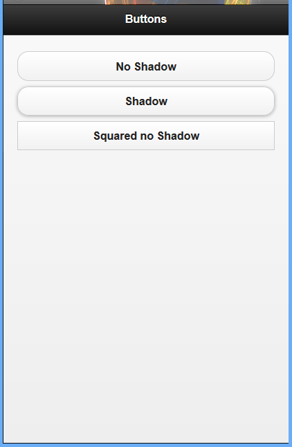
REMOVING THE SHADOW
Another option you may want to change is the appearance of a drop shadow under your button.
This can be changed by using the data-shadow="false" attribute. You are not limited to using only one data attribute per element. You can combine them to get different styles.
Changing Button Appearance with Data Attributes
Example 34: adding persistent navigation
!DOCTYPE html
html
head
  titleScript-tutorials: Buttons jQuery Mobile/title
  meta name="viewport" content="width=device-width, initial-scale=1"
  link rel="stylesheet" href="http://code.jquery.com/mobile/1.1.0/jquery.mobile-1.1.0.min.css" /
  script src="http://code.jquery.com/jquery-1.7.1.min.js"/script
  script src="http://code.jquery.com/mobile/1.1.0/jquery.mobile-1.1.0.min.js"/script
/head
body
  div data-role="page"
    div data-role="header"
      h1Buttons/h1
    /div
    div data-role="content"
      a href="#" data-role="button" data-shadow="false"No Shadow/a
      a href="#" data-role="button"Shadow/a
      a href="#" data-role="button" data-corners="false" data-shadow="false"Squared no Shadow/a
    /div
  /div
/body
/html
CHANGING THE BUTTON SIZE
Whenever we previously created a button, we didn’t worry about the size of the button. While you may not ever need to change the default size of a button, you may run into a few problems or some unexpected results with the default size.
Example 35: Changing the Default Button Width with a Data Attribute
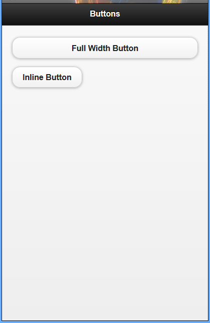 We added
 data-inline="true" as an attribute to the element. Adding this attribute causes the button to use only as much space as the content inside it.
!DOCTYPE html
html
head
  titleScript-tutorials: Buttons jQuery Mobile/title
  meta name="viewport" content="width=device-width, initial-scale=1"
  link rel="stylesheet" href="http://code.jquery.com/mobile/1.1.0/jquery.mobile-1.1.0.min.css" /
  script src="http://code.jquery.com/jquery-1.7.1.min.js"/script
  script src="http://code.jquery.com/mobile/1.1.0/jquery.mobile-1.1.0.min.js"/script
/head
body
  div data-role="page"
    div data-role="header"
      h1Buttons/h1
    /div
    div data-role="content"
      a href="#" data-role="button"Full Width Button/a
      a href="#" data-role="button" data-inline="true"Inline Button/a
    /div
  /div
/body
/html
Example 36: placing button inline
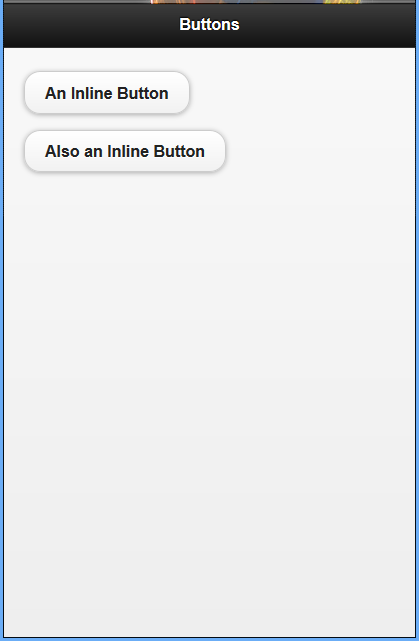 Both button have the attribute
 data-inline="true". This means that both buttons will appear next to each other. Adding more buttons with the same attribute will continue to line them up next to each other. Buttons will continue to line up next to each other until the maximum width has been reached.
!DOCTYPE html
html
head
  titleScript-tutorials: Buttons jQuery Mobile/title
  meta name="viewport" content="width=device-width, initial-scale=1"
  link rel="stylesheet" href="http://code.jquery.com/mobile/1.1.0/jquery.mobile-1.1.0.min.css" /
  script src="http://code.jquery.com/jquery-1.7.1.min.js"/script
  script src="http://code.jquery.com/mobile/1.1.0/jquery.mobile-1.1.0.min.js"/script
/head
body
  div data-role="page"
    div data-role="header"
      h1Buttons/h1
    /div
    div data-role="content"
      a href="#" data-role="button" data-inline="true"An Inline Button/a
      a href="#" data-role="button" data-inline="true"Also an Inline Button/a
    /div
  /div
/body
/html
ADJUSTING BUTTON WIDTH AND PLACEMENT BY USING A GRID
Example 37: adjusting width and placing placing of button by using grid
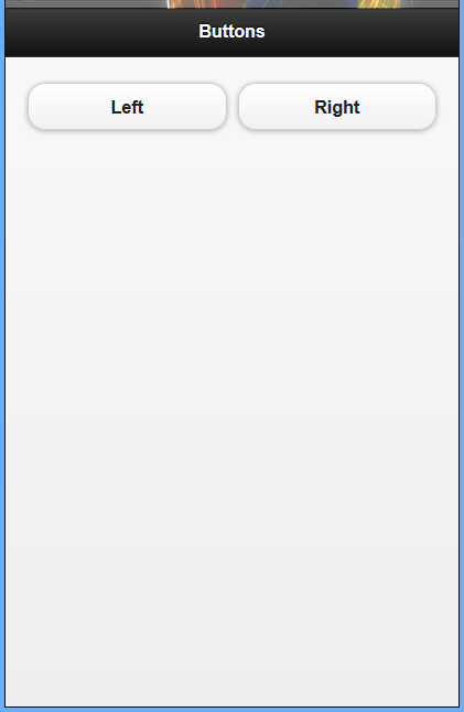 In this example, we see a simple two-column grid, A class of
 ui-block-a aligns content in the first column of the grid, while a class of ui-block-b aligns content in the second column.
!DOCTYPE html
html
head
  titleScript-tutorials: Buttons jQuery Mobile/title
  meta name="viewport" content="width=device-width, initial-scale=1"
  link rel="stylesheet" href="http://code.jquery.com/mobile/1.1.0/jquery.mobile-1.1.0.min.css" /
  script src="http://code.jquery.com/jquery-1.7.1.min.js"/script
  script src="http://code.jquery.com/mobile/1.1.0/jquery.mobile-1.1.0.min.js"/script
/head
body
  div data-role="page"
    div data-role="header"
      h1Buttons/h1
    /div
    div data-role="content"
      div class="ui-grid-a"
        div class="ui-block-a"a href="#" data-role="button"Left/a
        /div
        div class="ui-block-b"a href="#" data-role="button"Right/a
        /div
      /div
    /div
  /div
/body
/html


