


 Advertising Campaign Budget Tips")
 Tips For Small Business")


Vertical Timeline tutorial. Internet users love graphics that make it easier to digest information. Even more, they love interactive graphics that allow them to participate above and beyond just reading. Is it any wonder that vertical timelines do very well as a form of online content?
A vertical timeline can tell the story of your company and how it came to be. It could reveal the evolution of a product or service, discuss the history of a particular industry, or even walk your customers through the process by which you will provide your services. Best of all, you can create a vertical timeline on your own website with a little bit of CSS and JavaScript.
The point of this blog post is to give you a basic understanding of how you can do so. We will include some examples of code. However, you will not find a detailed implementation of code you can simply cut and paste. To make this work, you have to have a working knowledge of both CSS and JavaScript. By the way, lots of developers choose JavaScript for this sort of thing because it is so easy to use.
Start with the HTML
The HTML mark-up on your web page provides the content for your timeline. You will create this content the same way you would for any other kind of content. Below is the sample code:
!-- main timeline section --
section id="cd-timeline" class="cd-container cssanimations"
  !-- single timeline event --
  div class="cd-timeline-block"
    div class="cd-timeline-img cd-picture"
      img src="event-calender.png" /
    /div
    div class="cd-timeline-content"
      h2Event 1/h2
      pEvent 1 Description /p
      span class="cd-date"Sunday, 19 June 2016/span
    /div
  /div
  ....
  ....
/section
The example above allows for a single event on your timeline. Obviously, you will be adding multiple events – otherwise, you wouldn’t have a timeline! Just insert additional events by copying between lines three and eight of code, modifying them accordingly, and pasting them between lines eight and nine. Do it for as many events as you want to add to your timeline.
Style Your Timeline
You could style your timeline using standard HTML mark-up, but that is extremely time-consuming and rather redundant. It is better to use CSS styles instead. Below is some sample code for the base CSS style; you will have to style your individual elements with separate code:
#cd-timeline {
  position: relative;
  padding: 2em 0;
  margin-top: 2em;
  margin-bottom: 2em;
}
#cd-timeline::before {
  /* this is the vertical line */
  content: '';
  position: absolute;
  top: 0;
  height: 100%;
  width: 4px;
  background:
  left: 50%;
  margin-left: -2px;
}
.cd-container::after {
  content: '';
  display: table;
  clear: both;
}
.cd-container {
  width: 90%;
  max-width: 1170px;
  margin: 0 auto;
}
.cd-timeline-block:first-child {
  margin-top: 0;
}
.cd-timeline-block {
  position: relative;
      margin: 4em 0;
}
.cd-timeline-content {
  margin-left: 0;
  padding: 1.6em;
  width: 42%;
  position: relative;
  background: white;
  border-radius: 0.25em;
  padding: 1em;
  box-shadow: 0 3px 0
}
.cd-timeline-content .cd-date {
  position: absolute;
  width: 100%;
  left: 122%;
  top: 6px;
  font-size: 16px;
  font-size: 1rem;
}
.cd-timeline-block:nth-child(even) .cd-timeline-content .cd-date {
  left: auto;
  right: 122%;
  text-align: right;
}
.cd-timeline-block:nth-child(even) .cd-timeline-content {
  float: right;
}
.cd-timeline-block:after {
  content: "";
  display: table;
  clear: both;
}
.cd-timeline-img {
  width: 60px;
  height: 60px;
  left: 50%;
  margin-left: -30px;
  -webkit-transform: translateZ(0);
  -webkit-backface-visibility: hidden;
}
.cd-timeline-img {
  position: absolute;
  top: 0;
  border-radius: 50%;
  box-shadow: 0 0 0 4px white, inset 0 2px 0 rgba(0, 0, 0, 0.08), 0 3px 0 4px rgba(0, 0, 0, 0.05);
  background:
}
.cd-timeline-img img,.cd-timeline-img svg {
  display: block;
  width: 24px;
  height: 24px;
  position: relative;
  left: 50%;
  top: 50%;
  margin-left: -12px;
  margin-top: -12px;
  vertical-align: middle;
}
.cssanimations .cd-timeline-img.is-hidden,.cssanimations .cd-timeline-content.is-hidden {
  visibility: hidden;
}
.cssanimations .cd-timeline-img.bounce-in,.cssanimations .cd-timeline-content.bounce-in {
  visibility: visible;
  animation: cd-bounce-1 0.6s;
}
@keyframes cd-bounce-1 {
  0% {
    opacity: 0;
    transform: scale(0.5);
  }
  60% {
    opacity: 1;
    transform: scale(1.2);
  }
  100% {
    transform: scale(1);
  }
}
You can style the elements of your timeline in whatever way you like. You will use the corresponding CSS rules relating to:
- position
- bottom
- width
- height
- padding
- background
- border style
Some web developers prefer to style elements differently as they progress down the timeline. For example, you might want to make every other entry a different style in order to provide a means of distinguishing between them. Or, you may style different elements according to some predetermined category.
Add Your JavaScript
The last step in creating a vertical timeline is to add the JavaScript that will make the timeline interactive. How complicated you make this code depends on how you want your timeline to interact. For example, a very simple timeline that scrolls and doesn’t include any child items could be implemented with a very easy script.
To add JavaScript, firstly you will use jQuery library or write your own code. There are variegated ways to use jQuery, you can either
• Download the jQuery library from jQuery.com
‘or’
• Include jQuery from a CDN, like Google
script src="https://code.jquery.com/jquery-1.12.4.min.js"/script
After adding the jQuery library, you will work on making your timeline’s Event more interactive:
$(window).on('scroll', function(){
  $('.cd-timeline-block').each(function(){
    if( $(this).offset().top = $(window).scrollTop()+$(window).height()*0.75  $(this).find('.cd-timeline-img').hasClass('is-hidden') ) {
      $(this).find('.cd-timeline-img, .cd-timeline-content').removeClass('is-hidden').addClass('bounce-in');
    }
  });
});
With a little bit of CSS and JavaScript, you can create an interactive vertical timeline your visitors would surely appreciate. In the above code I used a customized bounce effect to give the timeline a more appealing look. Similarly, even you can use different elements to enhance the look of your vertical timeline.
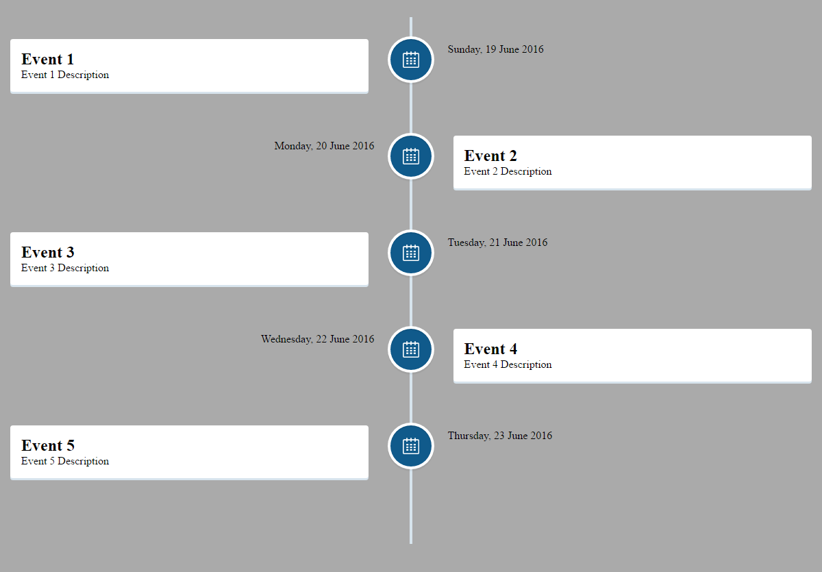
Here’s the screenshot of the result that I got after applying the above-mentioned code:

Hope the article would help you in creating your own vertical timeline with CSS and JavaScript effectually,
Good Luck!
Live Demo
[sociallocker]
download in package
[/sociallocker]


